- Client
- Abode
- Sector
- Property
- Where
- Staffordshire
- Stages
- Grow
01 / The brief
Stand out on the high street.
Estate agents can all start to look the same: a logo on a board and a photo of a kitchen. Abode wanted its marketing to get noticed locally and to feel like the friendly, local business it is.
Alongside the campaign work, we asked a bigger question: what would Abode look like if the brand itself felt as warm as the people behind it?
02 / What we did
Campaigns, then a concept.
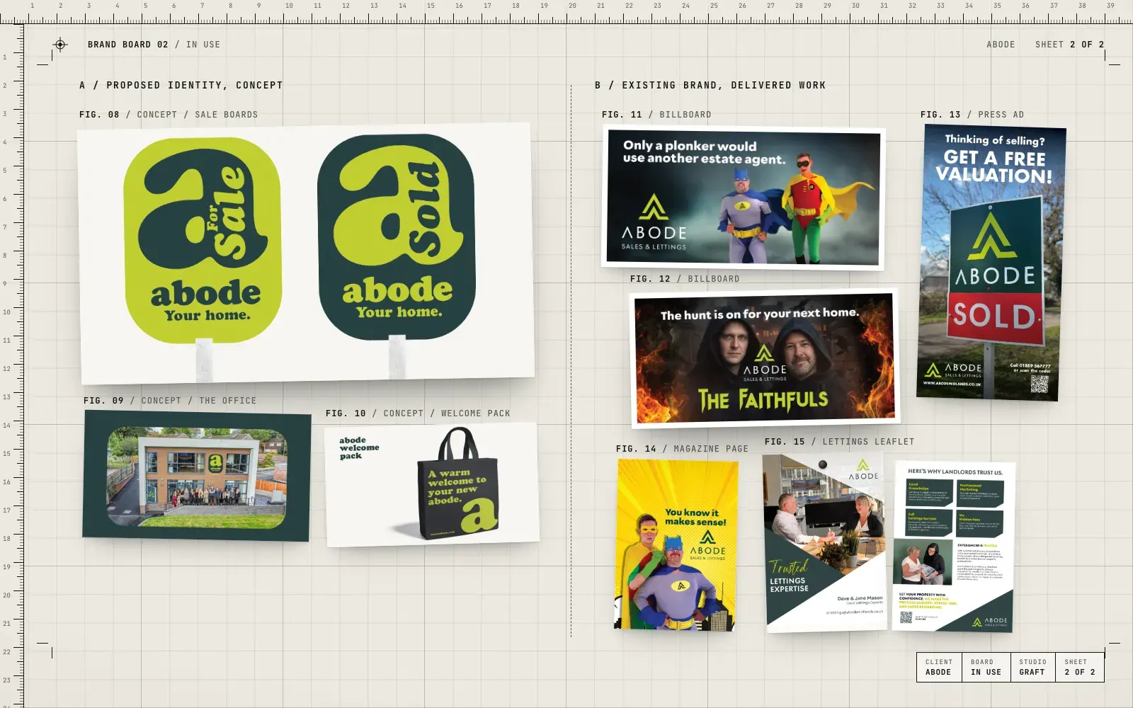
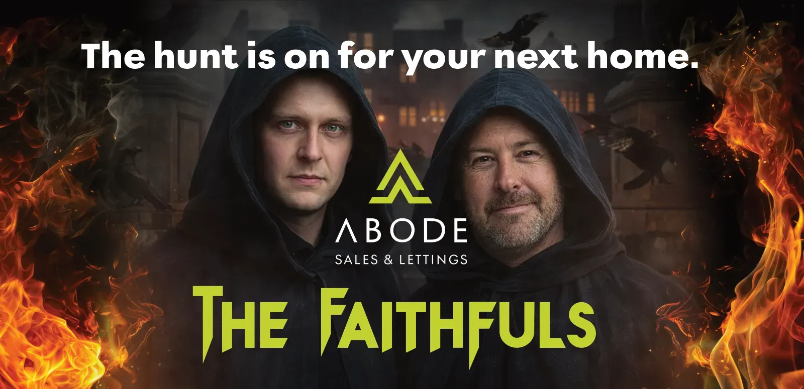
- Billboard campaigns with a sense of humour, shot with the team in costume
- A free valuation press ad
- A lettings leaflet for landlords
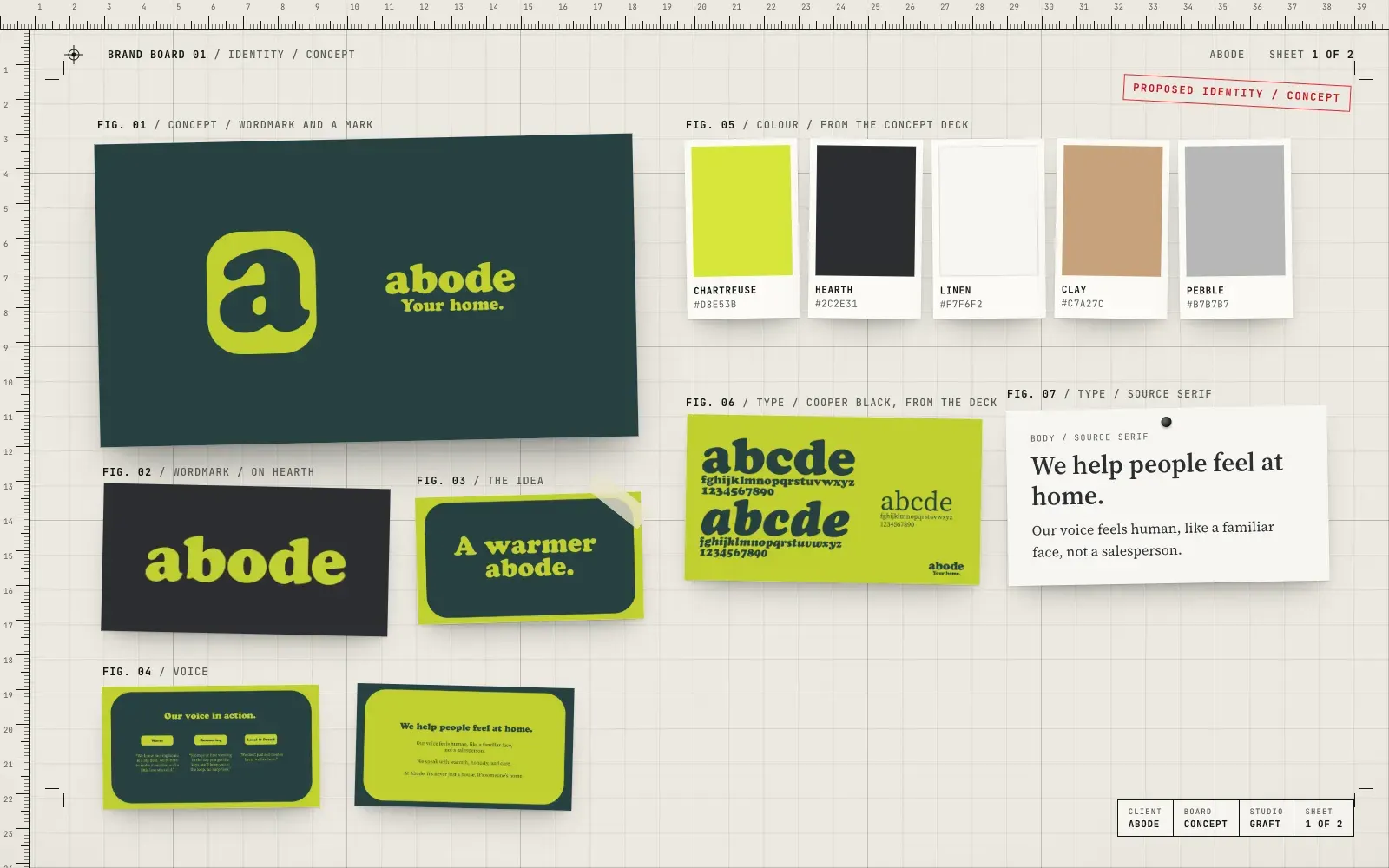
- A proposed new identity, "A warmer abode", with a new wordmark and "a" mark
- A concept colour palette, type and tone of voice
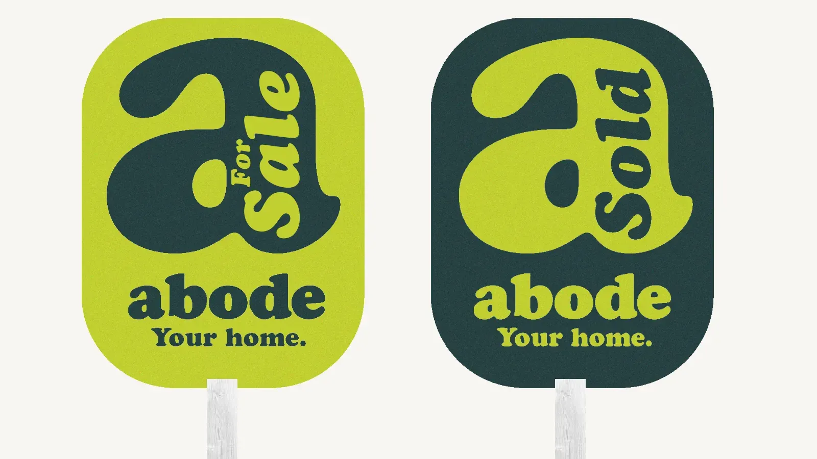
- Concept sale boards, office signage and a welcome pack for new homeowners
03 / The result
Two sides of one agent.
The campaigns went out in Abode's existing brand. The warmer identity was presented as a concept for where the brand could go next, and it stays a proposal for now.
04 / The longer story
Campaigns people talk about
Most of our work for Abode was in its existing brand: billboards, press ads and print that had to earn a second look. The billboards leaned into humour. The team dressed up as superheroes for one campaign and went full reality-TV for another, "The hunt is on for your next home". A free valuation ad and a lettings leaflet for landlords kept the day-to-day marketing sharp.
A warmer abode
Then we went further and proposed a new identity. The idea was simple: an estate agent that helps people feel at home should feel warm itself. The concept swaps the capital-letter wordmark for a friendly lowercase "abode" set in Cooper Black, with a big round "a" that works as a mark on its own.
The palette pairs a bright chartreuse with a deep hearth green, softened with linen, clay and pebble. The tone of voice is reassuring, warm, and local and proud. It speaks like a familiar face, not a salesperson.
How it could live
To show how the concept would work in the real world, we mocked it up where people meet an agent: For Sale and Sold boards, the office frontage and a welcome pack bag for people picking up their keys. Every piece is built around the same round "a".
Where it stands
To be clear, the warmer abode is a concept. It was presented to Abode as a proposed direction and hasn't launched. The campaign work on this page went out in Abode's existing brand.
05 / Services on this job