- Client
- HERE Technologies
- Sector
- Technology
- Where
- Chicago and worldwide
- Stages
- Grow
01 / The brief
Show people what it's like inside.
HERE Technologies builds a location and mapping platform used in cars, apps and businesses around the world. It wanted a fresh way to attract tech talent, one that showed what working there feels like, not just what the company makes.
Satellite shaped the employer value proposition and the line "Change is HERE". It works two ways: the change HERE brings to the world, and the change it can bring to your career. The design job was to turn that into something people could see.
02 / What we did
A brand language for HERE's people.
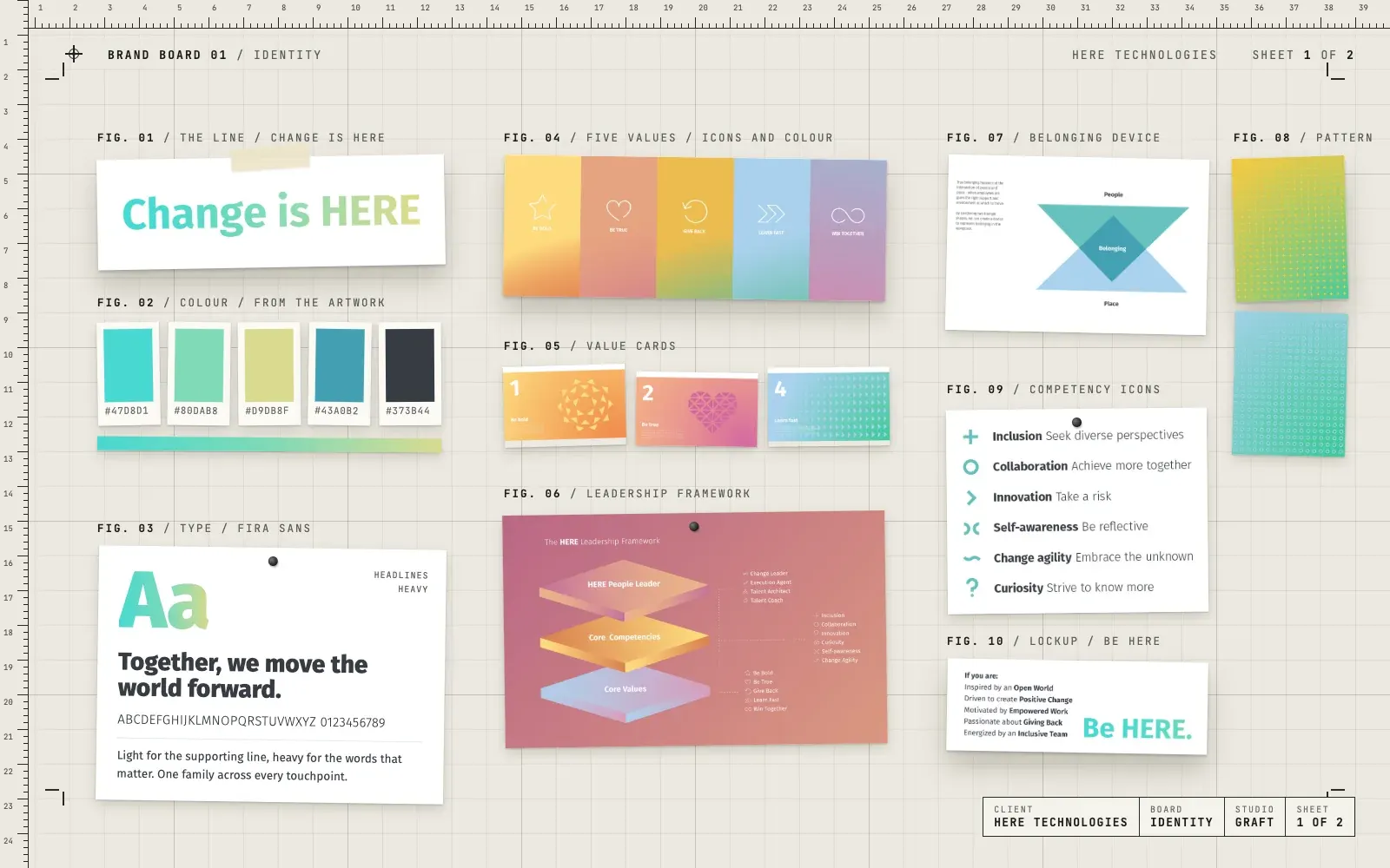
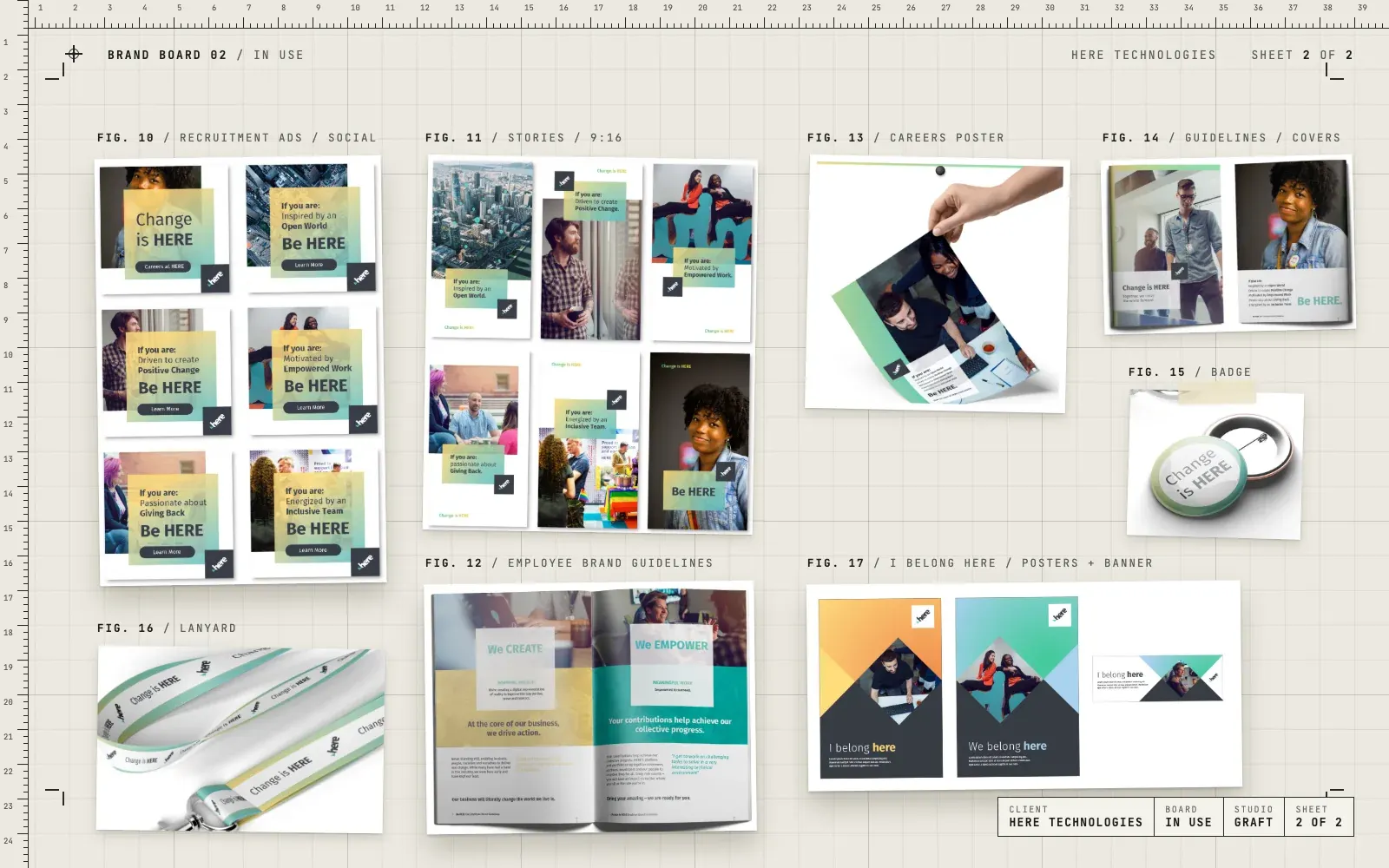
- A visual language for the employer brand, built on a soft colour gradient
- Type and colour rules, with Fira Sans running through everything
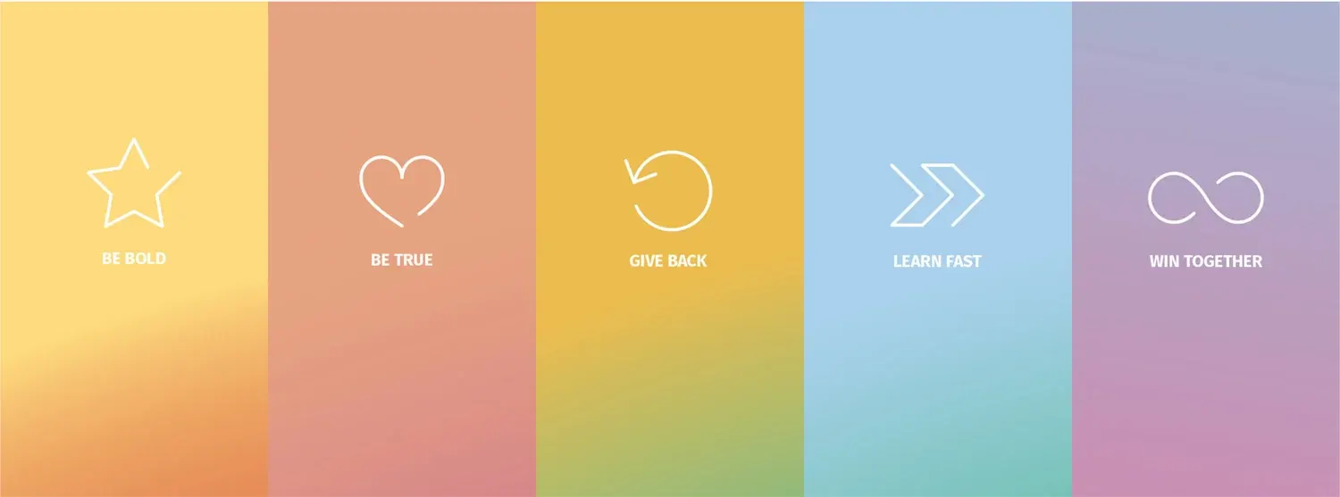
- Five value cards, each with its own colour, icon and geometric artwork
- A belonging device made from two triangles, for people and place
- Icons and patterns for the competencies behind the leadership framework
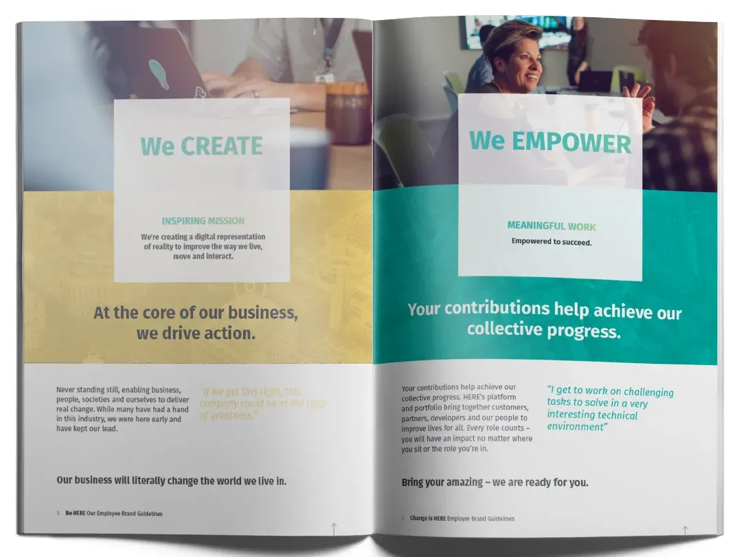
- Employee brand guidelines
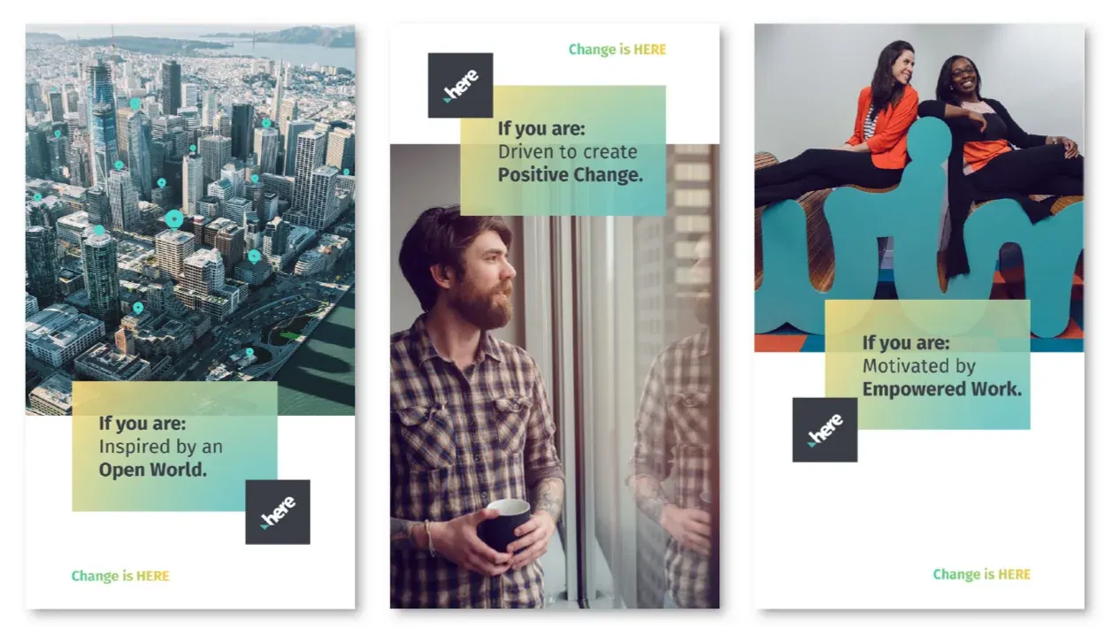
- Recruitment ads, social posts and stories in a family of "If you are" lines
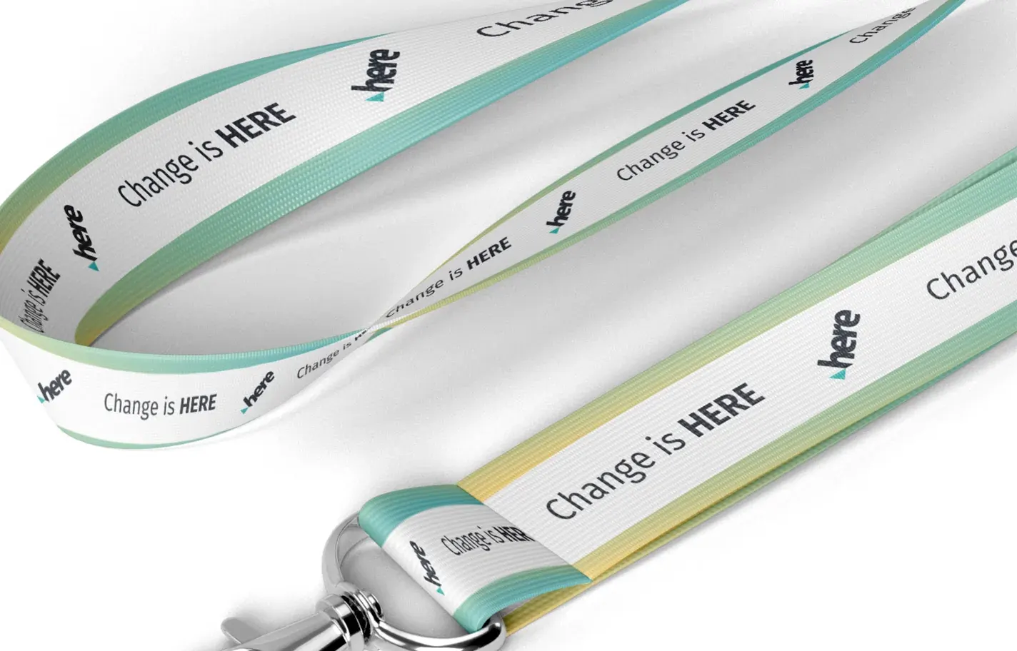
- Posters, a careers banner, lanyards and badges
03 / The result
One look, from careers page to lanyard.
HERE ended up with an employer brand that looks the same wherever someone meets it, from a social ad to a lanyard on a desk. The gradient and the "Change is HERE" line tie it together, and the values give every piece something real to say.
04 / The longer story
Who did what
Satellite, a brand agency in Chicago, led the employer brand strategy for HERE, with Erik and Jill Attkisson shaping the value proposition and the line "Change is HERE". Gav did the design: the look, the values artwork and the pieces that put it in front of people.
A gradient with a job
The employer brand needed to feel warm and human, so it moves on a soft colour gradient. It sits behind headlines, runs along the edge of a lanyard and fades across the panels on every ad. Fira Sans does the talking, light for the set-up and heavy for the words that matter.
Values you can see
HERE has five values: be bold, be true, give back, learn fast and win together. Each one got its own colour, its own line icon and a piece of artwork built from small triangles. A star of triangles for bold, a heart for true, a loop of arrows for learning fast. The triangle turns up again in the belonging device, where two triangles meet to stand for people and place.
If you are
The recruitment work talks straight to the reader. Every ad, story and poster starts with "If you are", then names the kind of person HERE is looking for, and ends on "Be HERE". Photos of people and places sit behind gradient panels, with the HERE logo in a dark tile in the corner. It's one simple pattern, so it scales from a square social post to a full poster.
Inside and out
The same language runs through the employee brand guidelines, so anyone at HERE can make the next piece. It also reaches the small stuff people actually keep: badges, lanyards and banners for careers events.
05 / Services on this job