- Client
- IWS Group
- Sector
- Workplace safety
- Where
- UK-wide
- Stages
- Start, Launch
01 / The brief
One group, four strong names.
IWS Group brings four workplace safety and storage companies together. Each one already had customers who knew and trusted it. The goal was a master brand that makes the group feel like one business, without losing what makes each company worth calling.
It had to work at every level: a strategy deck for the board, a spec sheet for a warehouse manager, a slide for a sales call and a sign on a unit wall.
02 / What we did
Foundations first, then the kit.
- Brand foundations and go-to-market strategy
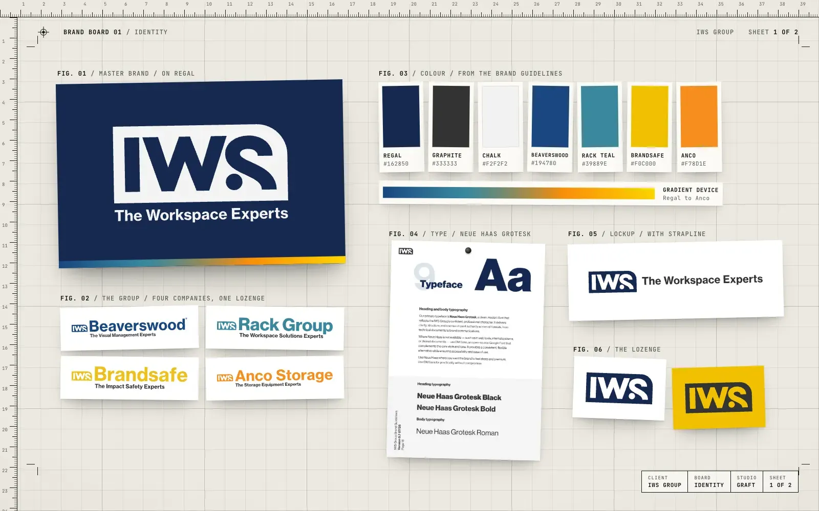
- The master brand route, with the IWS lozenge that every group company carries
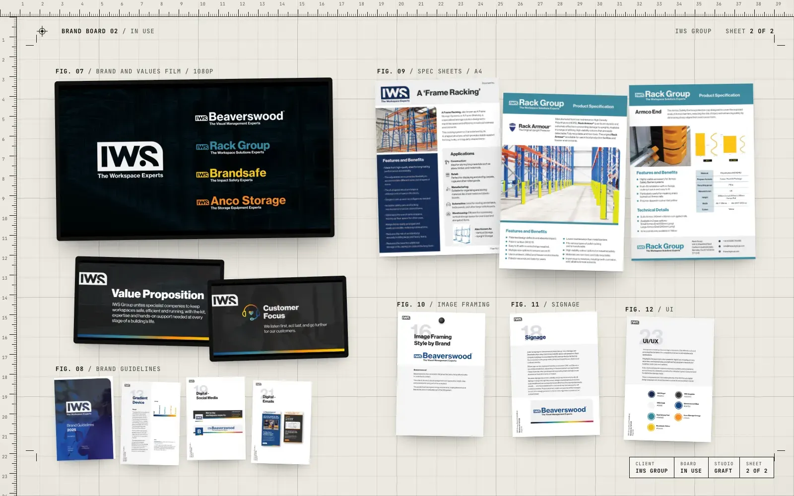
- A full set of lockups for IWS Group, Beaverswood, Rack Group, Brandsafe and Anco Storage
- Brand guidelines covering colour, type, tone of voice, image framing and signage
- A brand and values film for the whole team
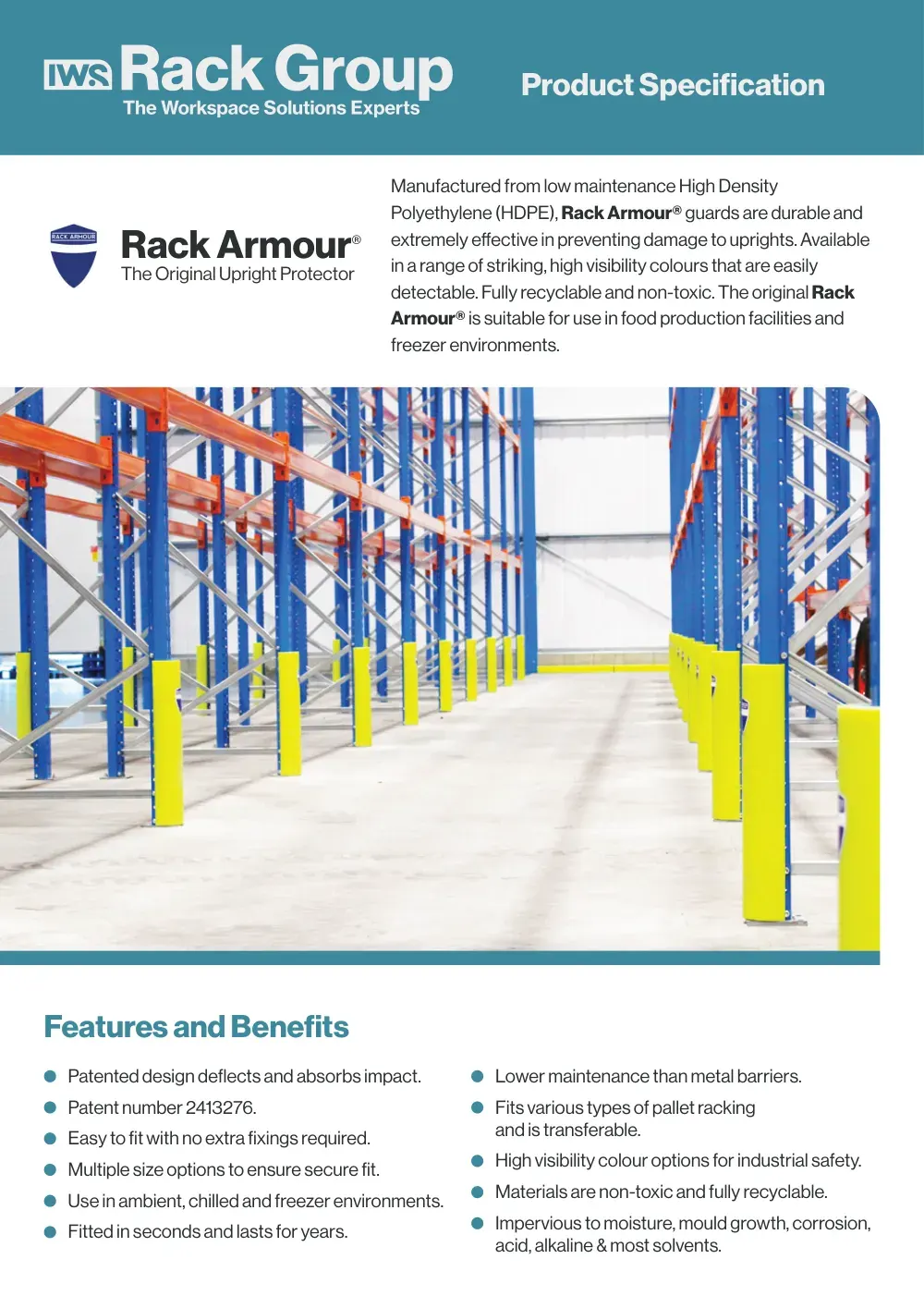
- Product spec sheets in the new system
- PowerPoint templates for the group and each company
03 / The result
A family that looks like one.
The IWS master brand has launched. Every company keeps its own colour and its own voice, and every one of them now carries the IWS lozenge, so a customer who knows one name can see the group behind it.
04 / The longer story
The lozenge that holds it together
The heart of the system is a small mark: the IWS lozenge. It sits in front of every company name, so Beaverswood, Rack Group, Brandsafe and Anco Storage each keep their own name and their own colour, and each one says "part of IWS" in the same way. Regal navy leads for the group. Beaverswood blue, Rack Group teal, Brandsafe yellow and Anco orange run together in a gradient band that appears across the group's materials.
A voice for each, one voice overall
The guidelines go further than logos. They set out how the group sounds, and how each company adds its own edge: the group clear and composed, Rack Group direct, Brandsafe urgent about safety, Beaverswood practical and visual. Image framing does the same job visually, with a rounded corner taken from the lozenge and an underline in each company's colour.
Telling the team first
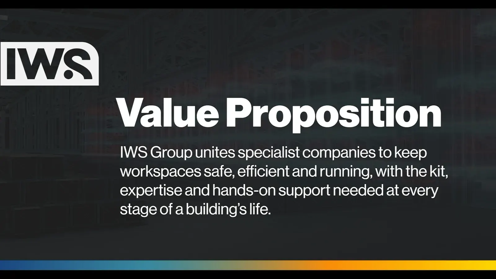
A brand like this lives or dies inside the business. So we made a brand and values film that walks the team through the vision, the value proposition and the values the group stands on. It's the first thing people see, before a single sign changes.
Built to be used
Then came the everyday kit. Spec sheets for the product ranges, PowerPoint templates for the group and each company, letterheads and email signatures, all in the same system. The aim was simple: whoever makes the next document shouldn't have to guess.
Launched
The master brand is now live across the group. The four companies still stand on their own, and each one now clearly belongs to something bigger.
05 / Services on this job