- Client
- Midland CSE
- Sector
- Health and care
- Where
- Birmingham
- Stages
- Grow
01 / The brief
A name people can trust.
Choosing home care is a big decision. Families are inviting someone into a parent's home, often at a hard time, and they want to feel sure before they pick up the phone. Carers weighing up a new job want to know they'll be looked after too.
The goal was a brand that feels warm and personal rather than clinical, and clear enough to read on a tunic, a phone screen or a care booklet.
02 / What we did
Warm, clear and personal.
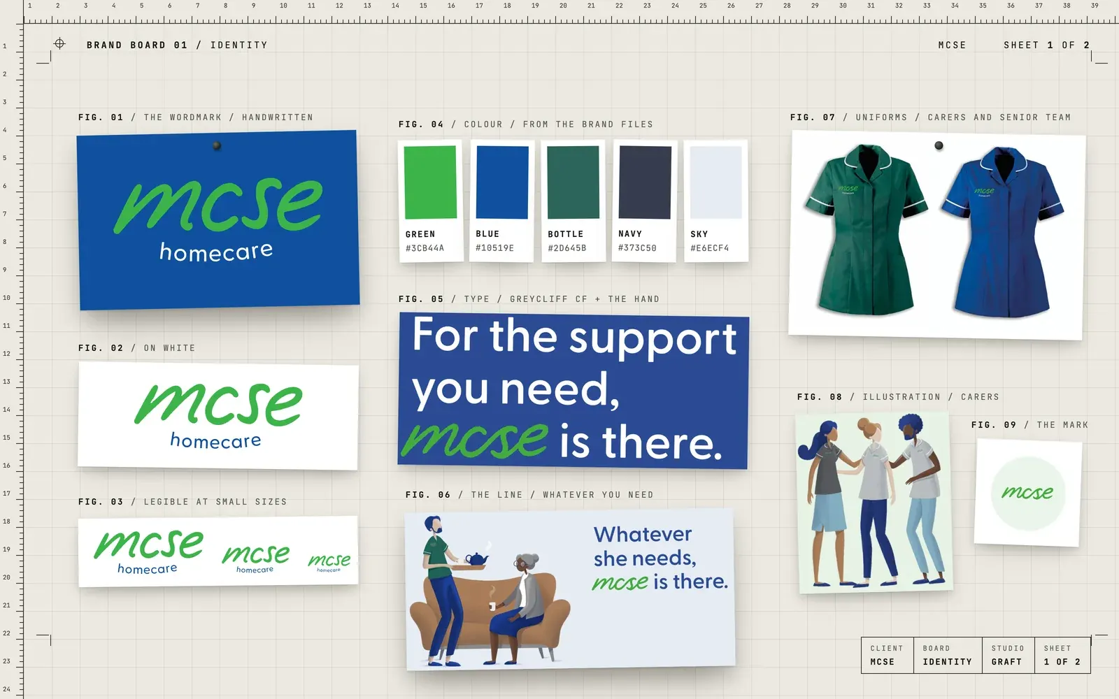
- A handwritten wordmark, refined so it reads clearly at small sizes
- The rebrand to MCSE, carrying the same hand and the same promise across
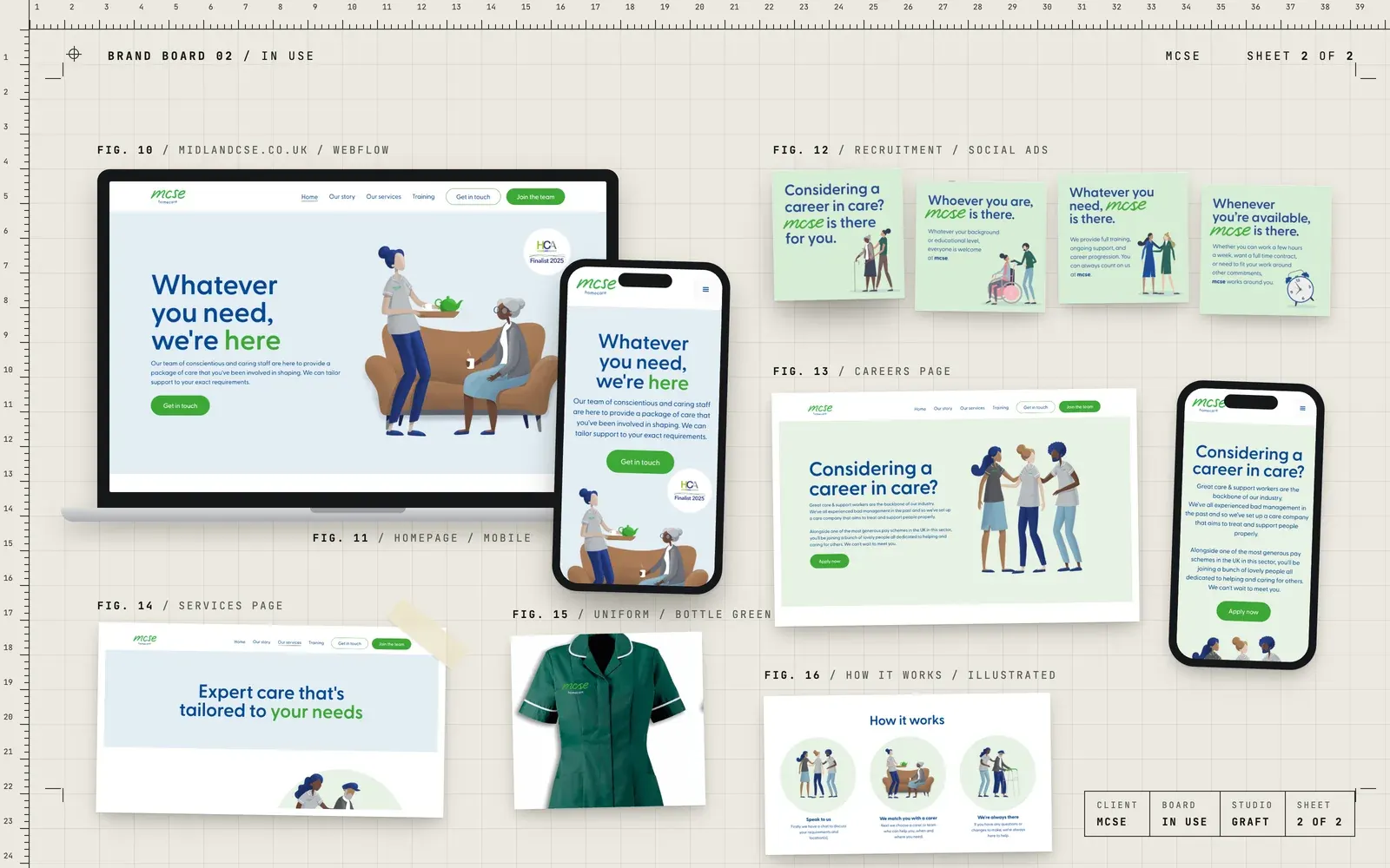
- The line "Whatever you need, mcse is there", and messaging built around it
- A colour palette of green, blue, bottle green and navy, set in Greycliff CF
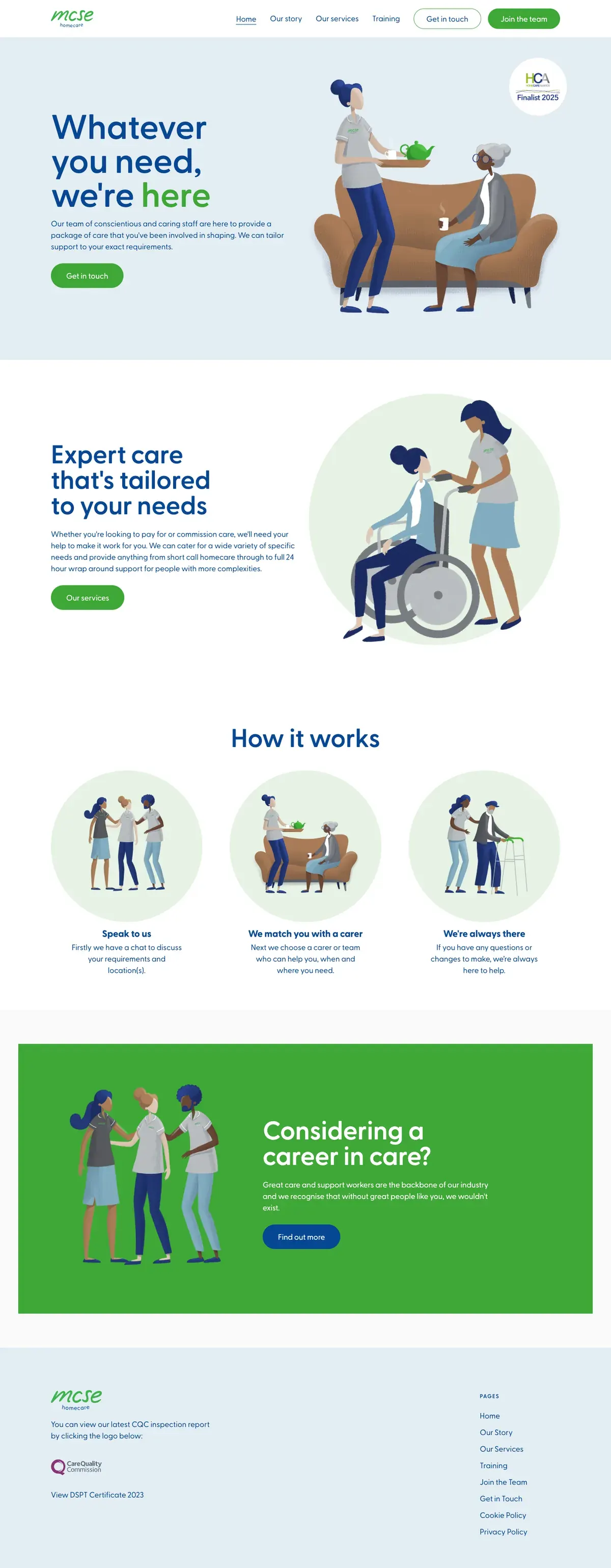
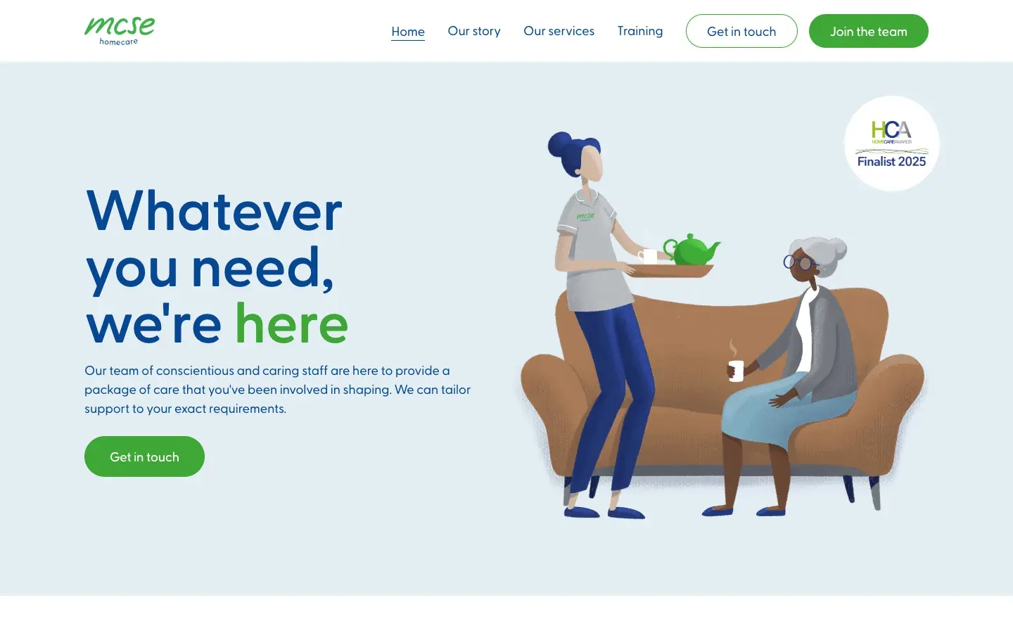
- Website design for midlandcse.co.uk, built in Webflow, with illustrations of carers in MCSE uniforms
- Recruitment ads and a careers page for people considering a career in care
- Uniform recommendations, with tunic colours for carers and the senior team
- A welcome booklet for new clients, designed for print
03 / The result
One hand, everywhere.
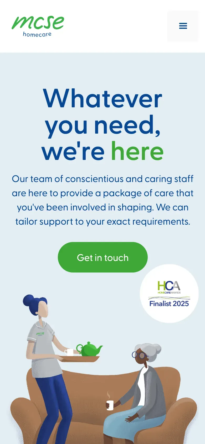
The handwritten mcse wordmark leads the live website today, alongside the illustrated carers, the green and blue palette and a careers page aimed at new carers. Families and future staff meet the same friendly brand wherever they find it.
04 / The longer story
Care starts with trust
Nobody shops for home care for fun. It usually starts with a phone call about a parent, a hospital discharge or a change that can't wait. So the brand had one job above all: feel like people you'd be glad to have in the house.
A name in someone's handwriting
Gav gave the name a wordmark that looks written by hand. Loose, friendly and personal, like a note left on the kitchen table. It was later refined for legibility, opening up the letters so it still reads clearly when it's small, on a tunic badge or a phone screen.
When the company moved to the name MCSE, short for Midland Care Support and Enablement, the hand came with it. The promise did too: "Whatever you need, mcse is there."
Colour, type and people
Green and blue lead, with bottle green and navy behind them and a soft sky blue for backgrounds. Headlines are set in Greycliff CF, a rounded typeface that feels calm and approachable. Illustrations of carers in MCSE uniforms show the care itself without using photos of real clients.
For the uniforms, Gav picked tunics from a catalogue for practical reasons as well as looks: dark colours that are easy to care for, with pockets. Bottle green for carers, royal blue for the senior team, with the wordmark embroidered in green on both.
A website that talks like a person
The website, built in Webflow, keeps things simple. What care MCSE offers, how it works in three steps, and how to get in touch. Short sentences, friendly headlines and the same illustrated carers throughout.
There's a second audience too. Good carers are hard to find, so a careers page and a set of recruitment ads speak to people considering a career in care: whoever you are, whatever you need, whenever you're available, mcse is there.
On paper too
For new clients, Gav designed a welcome booklet that explains the services, how care visits are monitored, how to raise a concern and who to contact. Plain words and a clear layout, because people often read it at a stressful moment.
Where this came from
This was Gav's work at his previous agency. It's here because it shows how we think about brands where trust matters most: keep it human, keep it clear, and make it feel the same everywhere people meet it.
05 / Services on this job