- Client
- Morro
- Sector
- Marketing collective
- Where
- UK
- Stages
- Start, Launch
01 / The brief
Look senior from day one.
Morro brings experienced marketing people together around each brief, rather than selling hours from a fixed team. It's a new name, so the brand had to feel settled and confident straight away, the way the people behind it already are.
It needed a mark that works as small as a browser tab and as big as a hero image, a palette with some warmth to it, and a website that gets the idea across in seconds.
02 / What we did
One arc, used everywhere.
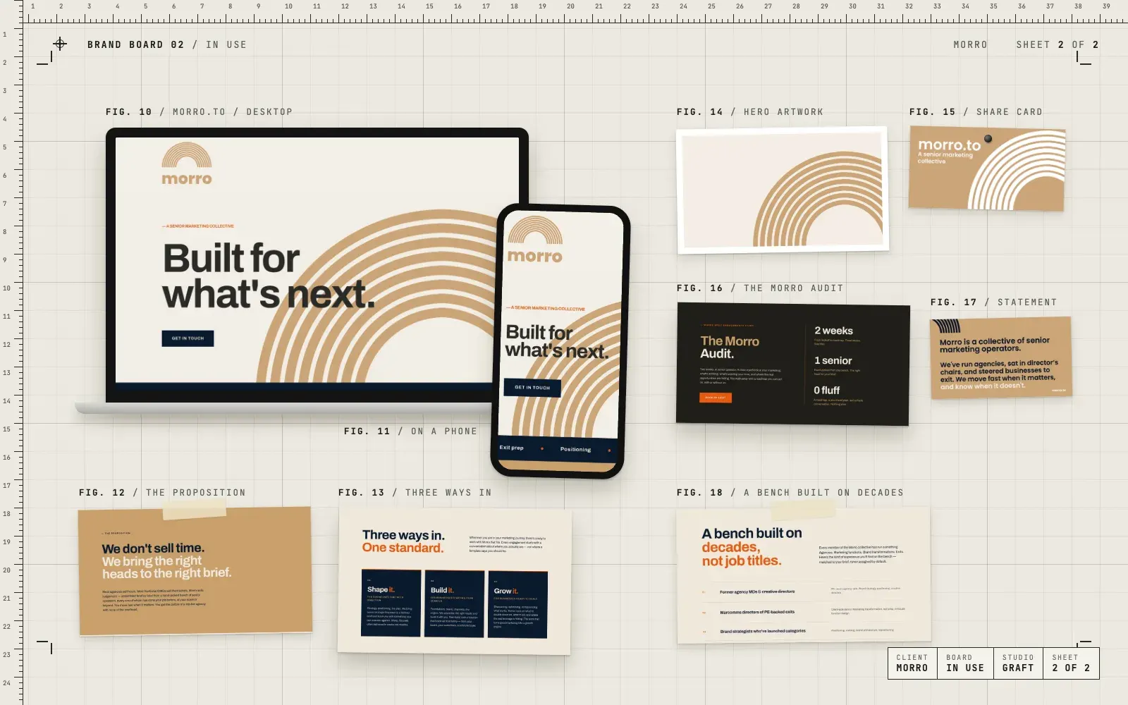
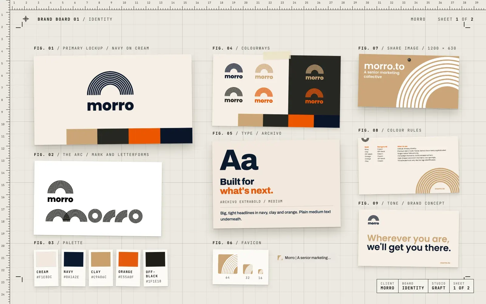
- The brand concept and the Morro logo, an arc made of stacked lines over a heavy lowercase wordmark
- Letterforms built from the same arcs, for a version of the name made entirely of lines
- A palette of cream, navy, clay, orange and off-black, with rules for which mark sits on which background
- Logo files in every colourway, with stacked, mark-only and morro.to versions
- A favicon and a share image for links on social and in messages
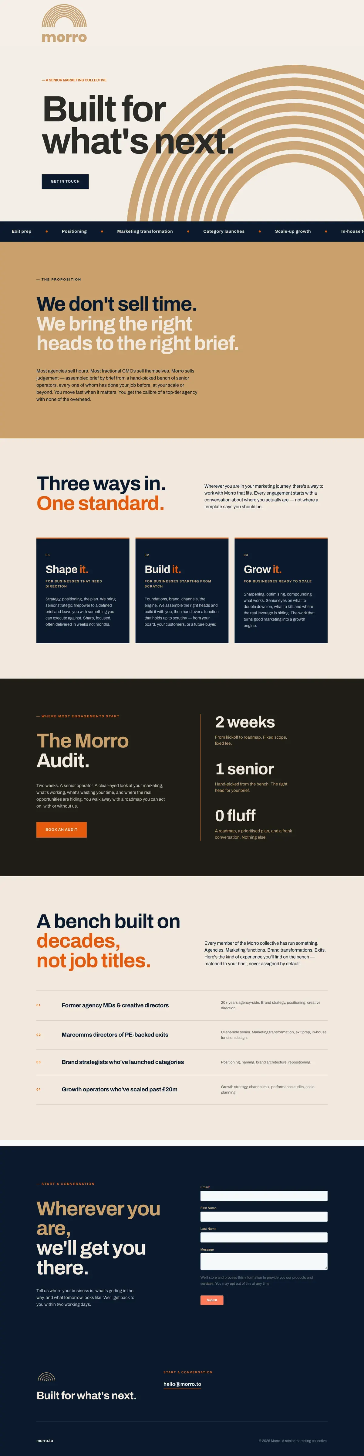
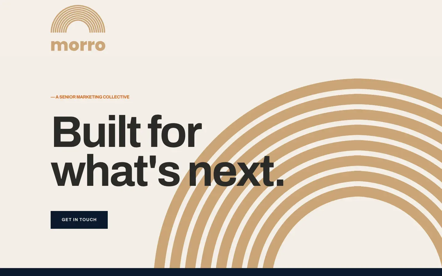
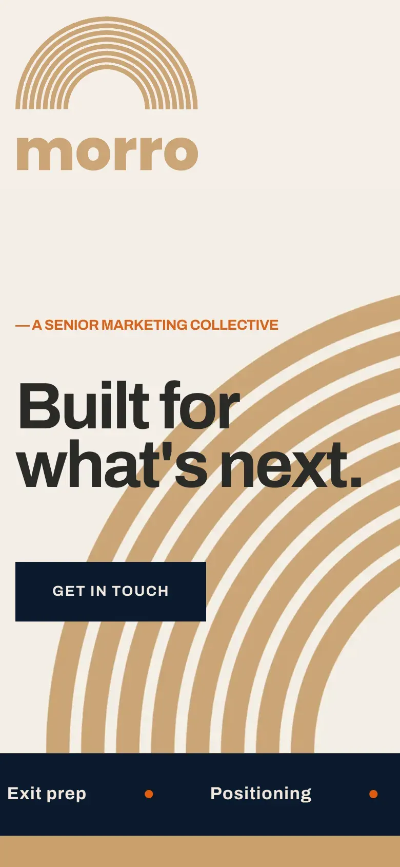
- Website for morro.to, designed and built on HubSpot, set in Archivo, with the arc as the hero artwork
03 / The result
A brand that hangs together.
Morro is live at morro.to. The arc runs from the browser tab to the hero, the share card and the footer, and the same five colours carry every section, so the collective looks like one thing wherever someone meets it.
04 / The longer story
A mark made of lines
The Morro mark is a half circle drawn as a stack of fine arcs, like ripples or a horizon. It sits over a heavy lowercase "morro", so the wordmark does the shouting and the arc does the feeling. We pushed the idea further and drew the whole name from the same arcs. That version works as a pattern, a big background or a sign-off.
Warm, not corporate
Plenty of consultancies go cold and blue. Morro leads with cream and navy for the everyday, then adds clay for warmth and orange for the moments that need a jolt. Off-black gives it a smart dark mode. We wrote simple rules for which colour of mark sits on which background, so nobody has to guess.
Small things done properly
A brand for people who've done this for years has to sweat the small stuff. So the arc became a favicon for the browser tab, and the share image gives every link to morro.to a proper card on social and in messages.
The website
We designed the site and built it on HubSpot, so the team can edit it themselves. It does a lot with very few words. Big Archivo headlines, the clay arcs behind the hero and short sections that each make one point: the proposition, the ways to work with Morro, a fixed-scope audit, the experience on the bench and a simple form to start a conversation. "Built for what's next" became the line that opens the site and closes the footer.
05 / Services on this job