- Client
- Nike Partner Club
- Sector
- Grassroots football
- Where
- England
- Stages
- Launch
- Motion graphics
- Silver Machine
01 / The brief
Big brand, local pitch.
Grassroots football happens on council pitches, in leisure centres and on Sunday mornings in the rain. A programme for those clubs has to carry one of the biggest names in sport without feeling distant from the people running the line and washing the kit.
The goal was an identity that clubs, coaches and players would feel part of, flexible enough for a training shirt, a club document and a phone screen.
02 / What we did
A club look for every club.
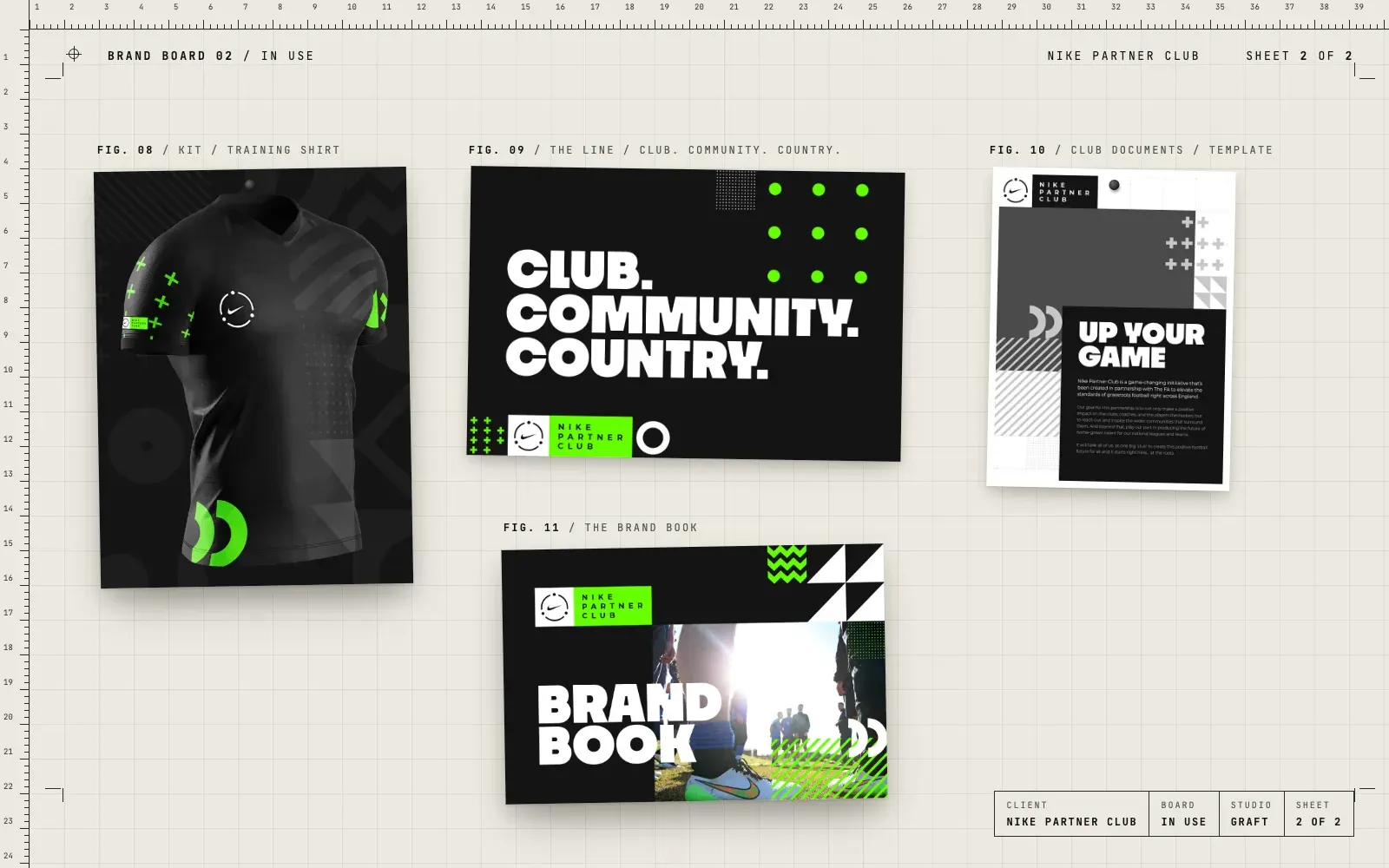
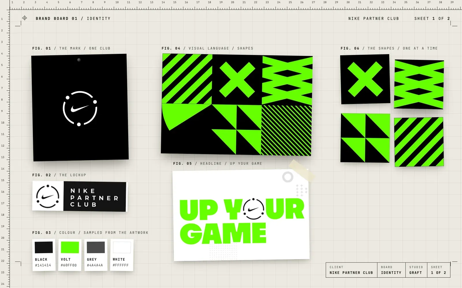
- A club mark built around the swoosh, with dots that read as people coming together
- The Nike Partner Club lockup
- A visual language of shapes in volt green and black, stripes, crosses, zigzags and triangles
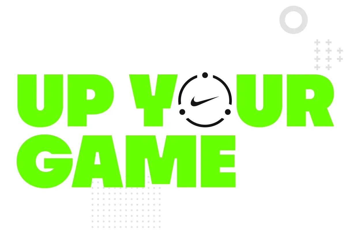
- Headlines and lines including "Up your game" and "Club. Community. Country."
- A brand book to keep it all consistent
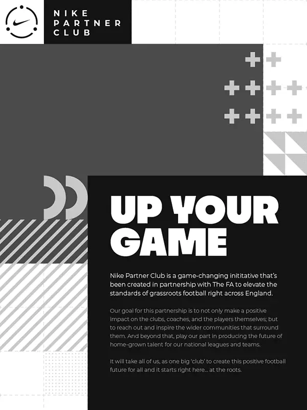
- Club document templates
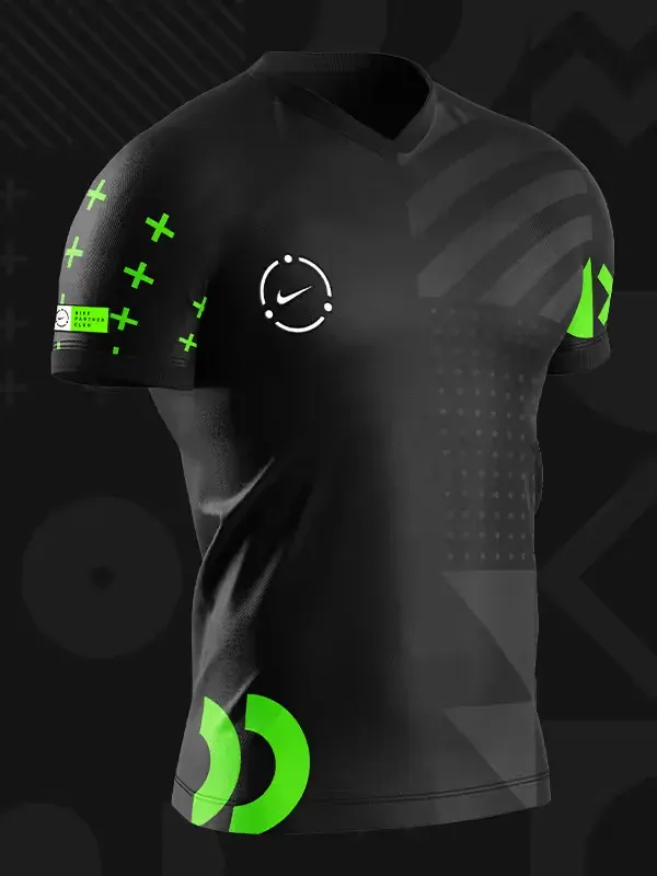
- A training shirt design using the mark and shapes
- Screens for the programme's digital platform
03 / The result
Clubs that look part of something.
The identity gave the programme one look that works from a brand book to a shirt sleeve, with shapes simple enough for any club to use well. For Gav it was a chance to work inside a big brand's rules and still make something that feels at home on a local pitch.
04 / The longer story
The idea of a club
A club is a group of people who turn up for each other. The mark says that simply: the swoosh in the middle, held inside a circle of dots that could be players, coaches or clubs. It works small on a sleeve and big on a banner, and it never needs explaining.
Shapes anyone can use
The visual language is a kit of bold shapes in volt green and black: stripes, crosses, zigzags, triangles and quarter circles. Put them in a grid for a poster, pick one for a social post, or run them down a shirt sleeve. Because they are simple, a club volunteer can use them and still get it right.
Words with a bit of a shout
Headlines are set big and heavy. "Up your game" puts the club mark where the O should be. "Club. Community. Country." says who the programme is for, in three words and three full stops.
Kept in a book
A brand book sets out how it all fits together, and club document templates give people a head start, so a letter or a guide looks like it belongs to the same programme as the shirt.
Where this came from
Gav was part of the team on this at his previous agency, alongside designers, motion specialists and developers. Graft does not work for Nike. It's here because it shows how we approach a brand that has to work for lots of people at once: a clear idea, simple tools and rules people will actually follow.
05 / Services on this job