- Client
- Paul Holmes Jewellery
- Sector
- Jewellery
- Where
- Liverpool
- Stages
- Launch
01 / The brief
Bring the showroom to more people.
Paul Holmes is a private jeweller. Customers come through Paul's network, events and word of mouth, and every visit is by appointment. The plan was to take that personal feel online to a much wider audience, without losing what makes it special.
So the brand had to feel as considered as the jewellery, and the website had to sell pieces properly, not just point people to the phone.
02 / What we did
Routes first, then the launch.
- Two rounds of creative routes, built around Liverpool
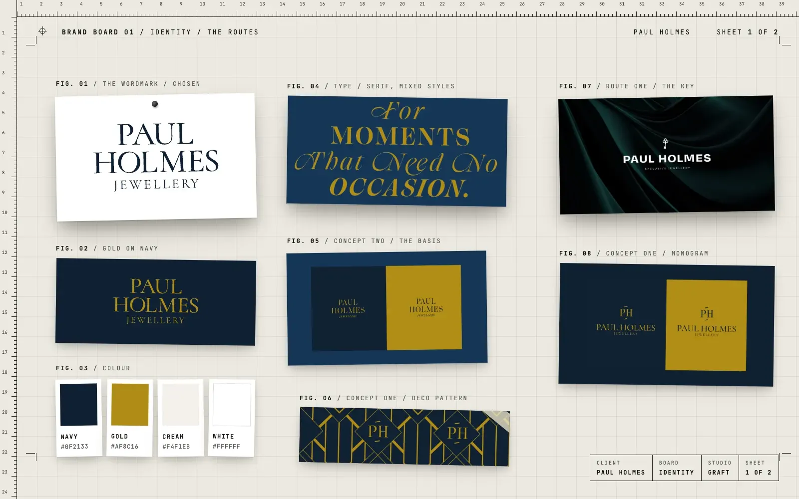
- A refreshed identity in navy and gold, led by a refined serif wordmark
- Packaging concepts for bags and wrapping
- A product photography approach for the range
- Short animations of the pieces, made from the product photography
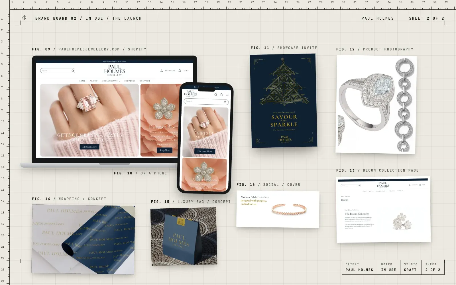
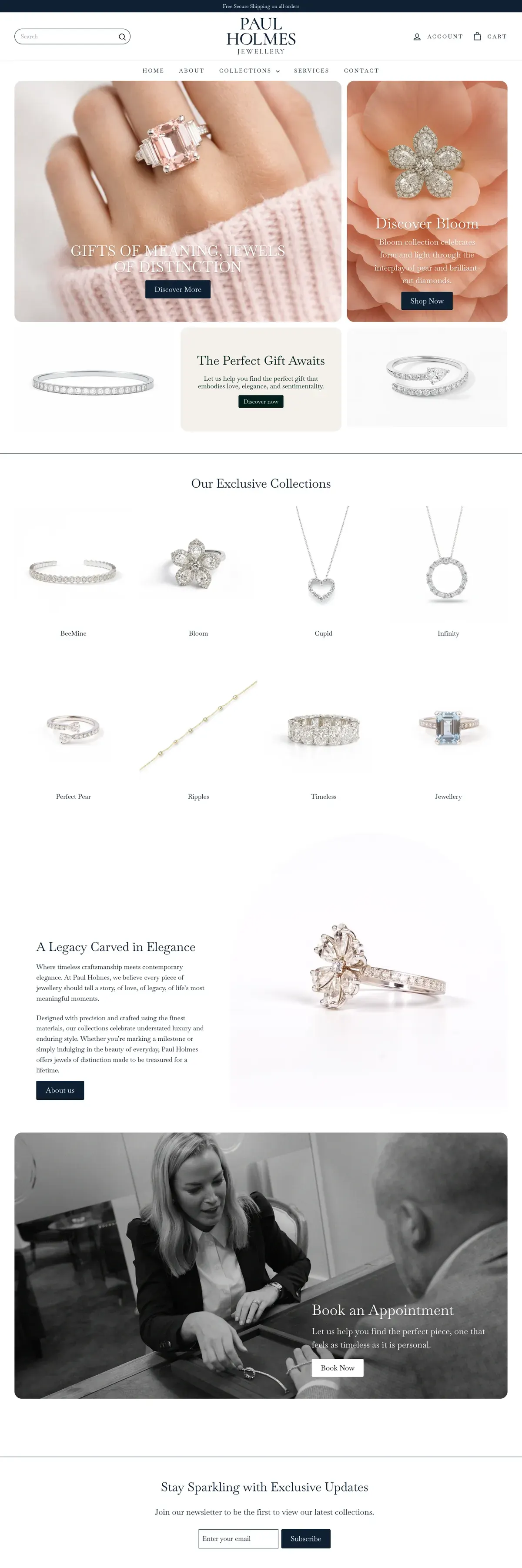
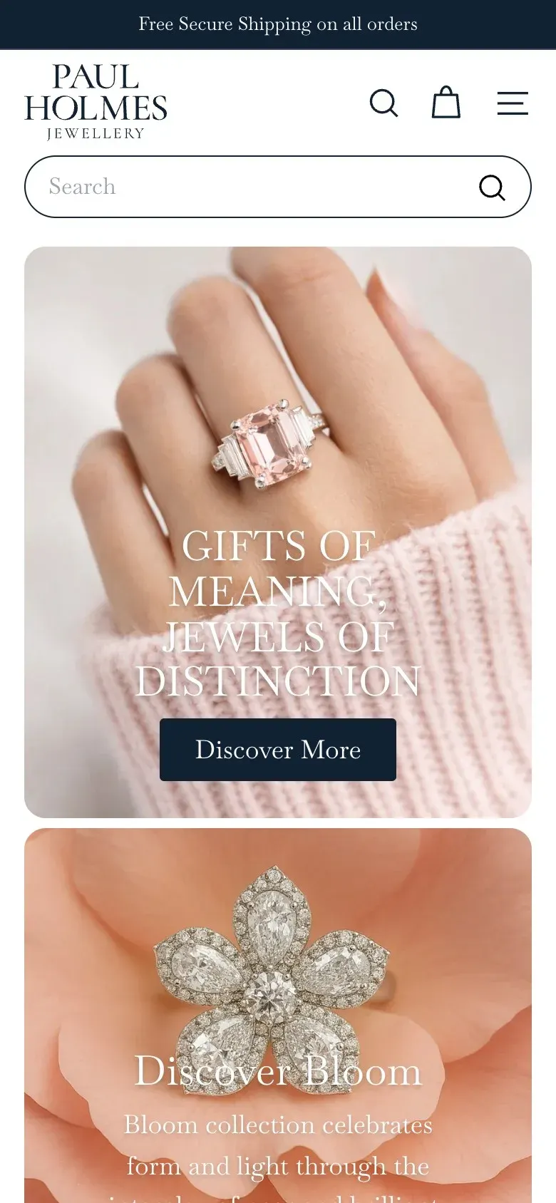
- A Shopify store with collections, product pages and appointment booking
- Klaviyo connected to the store, with branded email
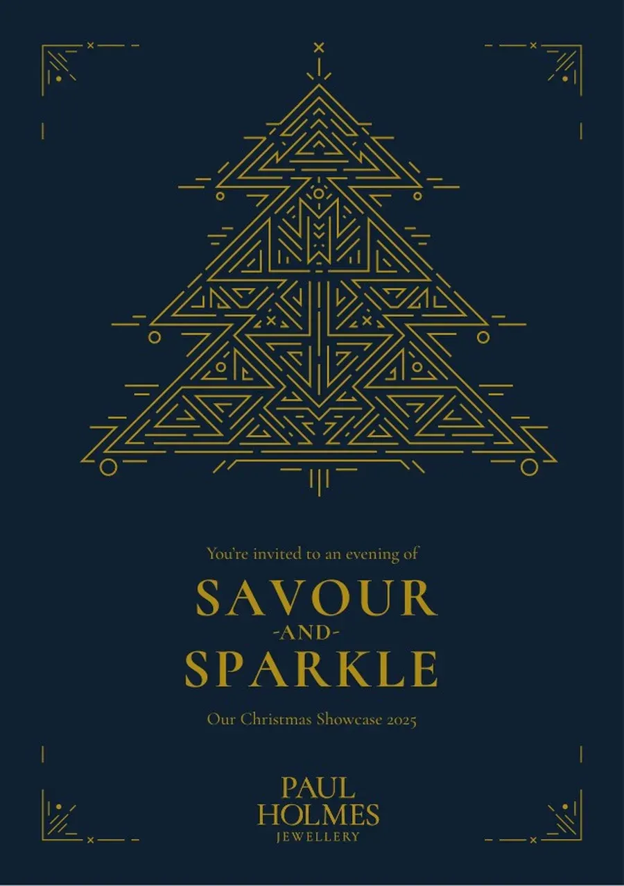
- Launch content, a Christmas showcase invite, social and reels
03 / The result
Live and selling.
The new Paul Holmes Jewellery brand is live on paulholmesjewellery.com, a Shopify store where customers can browse the collections, buy online or book an appointment. The packaging designs on this page are concepts.
04 / The longer story
Starting with the city
Paul learned his trade on Merseyside, so the creative work started with Liverpool. The first round included a key, for a jeweller where every piece holds a story. The second round went deeper into the city's Art Deco buildings. One concept built a monogram and a repeat pattern from Deco metalwork. The other stayed close to the brand people already knew and let the type do the talking.
Type that carries the brand
The chosen identity grew from that type-led route. A tall serif wordmark spells out Paul Holmes Jewellery with no device needed. Deep navy leads and gold is the accent, the colours customers already linked with Paul, used with more care. Mixed serif styles, roman and flowing italic, give the straplines their character, and the Deco detail from the other concept found its way into the launch artwork.
A store that sells
The Shopify store is the part that went live. It has a collection page for each range, such as Bloom, Timeless and Perfect Pear, product pages with prices and enquiries, the story of Paul and Jo, and appointment booking for bespoke work. Klaviyo is connected for sign-ups and email. For the photography, we worked out a lightbox method that gives the range a clean, consistent look without a costly retouching studio. We also mocked up a navy bag and patterned wrapping to show how the brand could carry through to packaging. Those are concepts.
Pieces that move
Fine jewellery is made to catch the light, and a still photo only shows one angle. So we turned the product photography into short animations of the pieces. A Bloom ring turns to show its petals. A Ripples band rolls to show the diamonds set round it. The Bee Mine earrings come in close enough to see the hexagon settings. They're the films at the top of this page, made for the store and social.
Launch
Around the launch we made the content to go with it: a Christmas showcase invite in navy and gold, social profile and cover artwork, collection reels and seasonal ads.