- Client
- Safe Pass
- Sector
- Community football
- Where
- UK-wide
- Stages
- Start
01 / The brief
Every pass is a lifeline.
Safe Pass is a football-led programme that works through football club charities to help refugees and asylum seekers make friends, look after their wellbeing, build their language and find a way into work. It needed a brand that felt like football, not like a form.
It also needed to win backing from businesses and football partners, so the brand had to hold its own in a partner pitch as well as on a training pitch.
02 / What we did
A brand, a pitch and a plan.
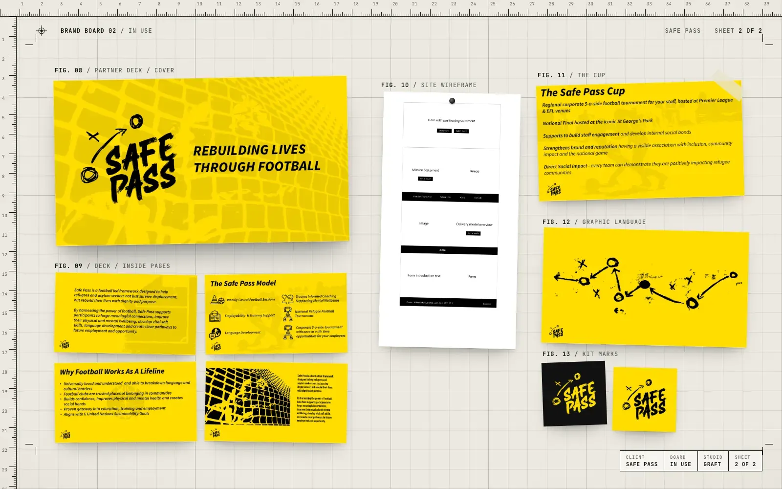
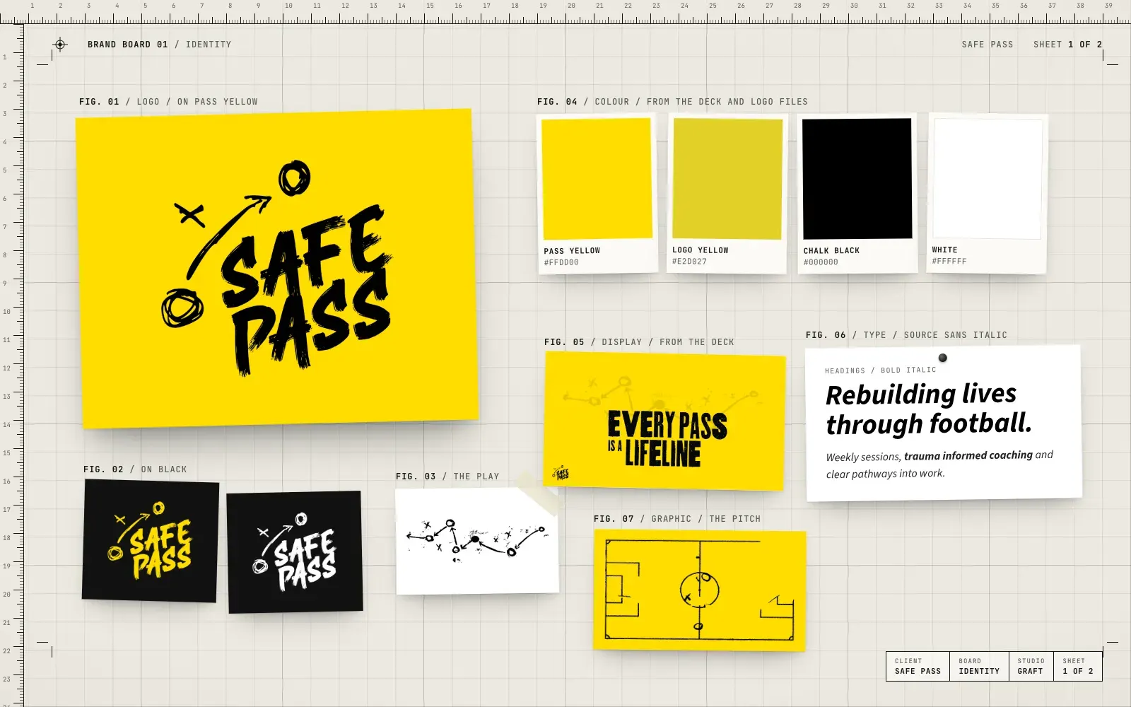
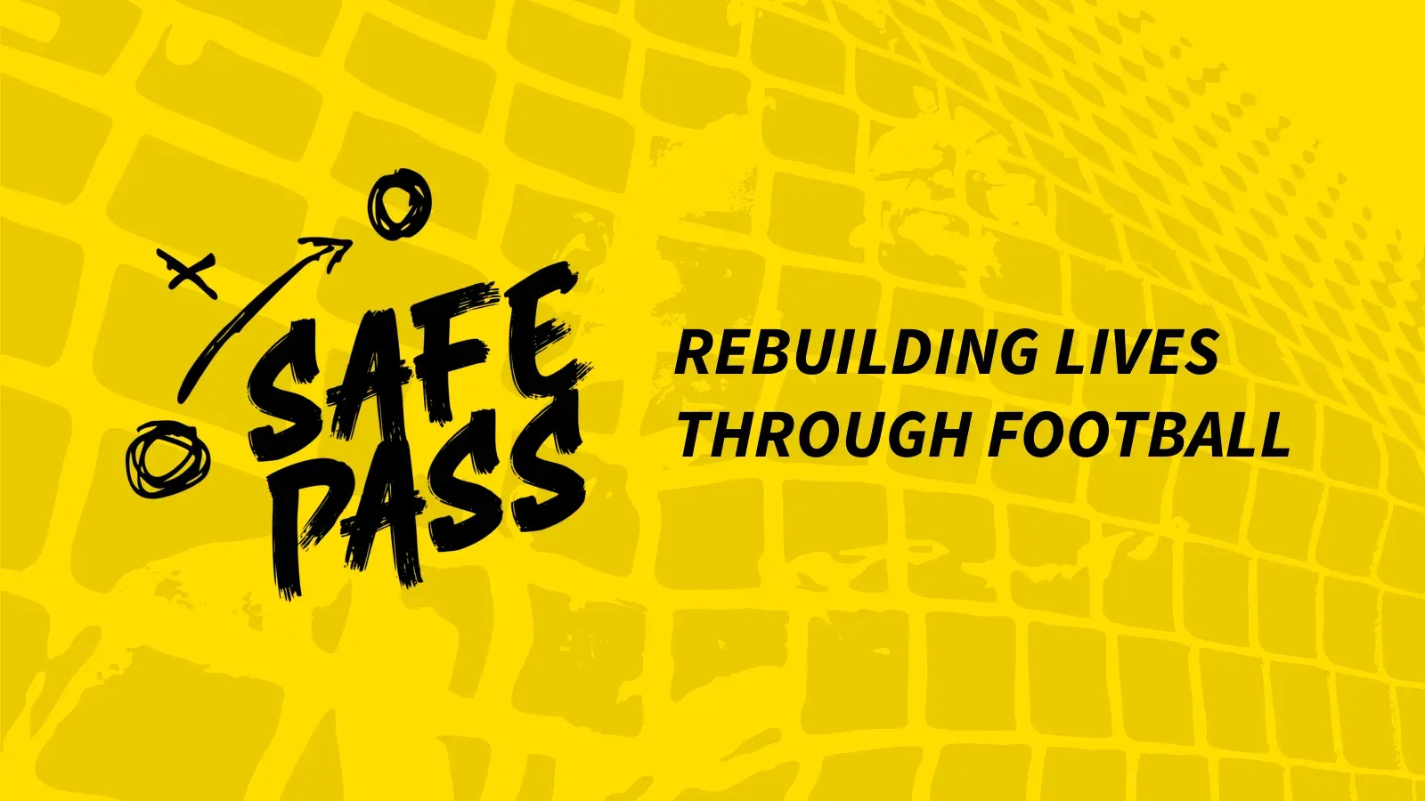
- Logo and identity, drawn by hand like a coach's tactics board
- Colour and type system in bold yellow and black
- Graphic language of plays, arrows and pitch markings
- A partner deck that explains the programme and the Safe Pass Cup
- Website structure and homepage wireframe
03 / The result
Ready to kick off.
Safe Pass has a brand that looks at home on a pitch, a deck it can take to partners and a clear plan for its website. The tactics-board look runs through all of it.
04 / The longer story
Chalk on the board
Football people draw. Crosses for players, circles for the ball, arrows for the run. We built the Safe Pass identity from that language: a brushy, hand-drawn wordmark with a play sketched around it, so the logo looks like it came straight off a coach's tactics board.
Yellow you can see from the touchline
The palette is simple on purpose. A bright pass yellow and black, with white where it's needed. It's loud enough for a banner at a ground and clear enough for a slide in a boardroom. Bold italic type keeps the pace up, and the pitch markings and play diagrams give every page something to hang on.
A deck that wins partners
Safe Pass works with football club charities and needs businesses behind it. The partner deck walks through who the programme is for, why football works as a way in, how the model runs week to week, and the Safe Pass Cup, a five-a-side tournament that gets partner teams playing for the cause.
A plan for the website
We mapped the site before a pixel was designed: a clear homepage with a mission statement, how the programme is delivered, and a simple way to get in touch, so the story in the deck carries straight through online.
05 / Services on this job