- Client
- Sonic Boom Festival
- Sector
- Music festival
- Where
- Burton upon Trent
- Stages
- Start, Launch
- Festival photography
- ACJ Media
01 / The brief
Make some noise in Burton.
A brand new festival has to build a crowd from nothing. People need to hear about it, believe it's real and want to be there, all before a single band plays. And it has to work for everyone from teenagers to people who saw the headliners first time round.
The goal was a brand that felt like the sound of a big night out: bright, bold and impossible to walk past on a poster or scroll past on a phone.
02 / What we did
One big bang, everywhere.
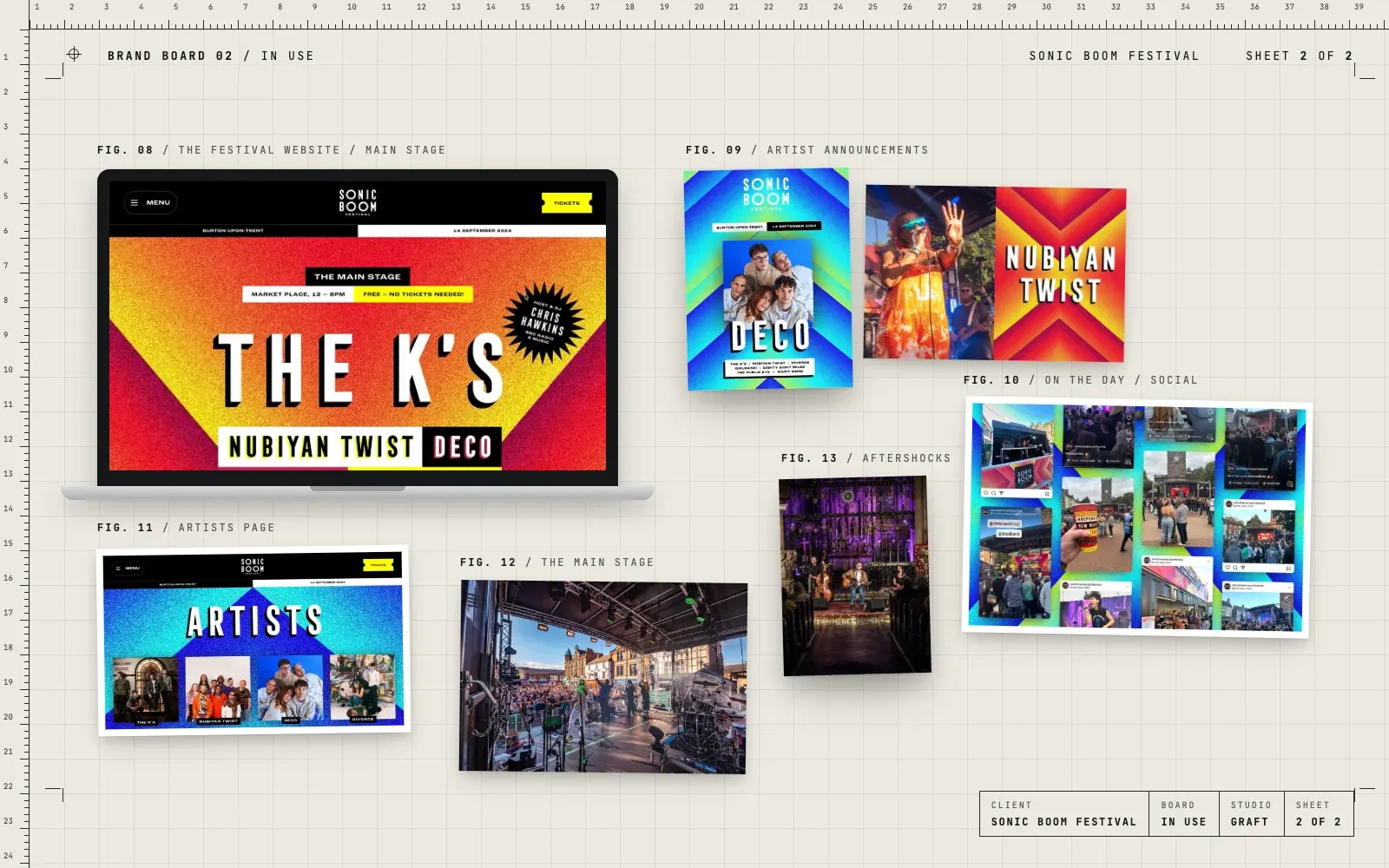
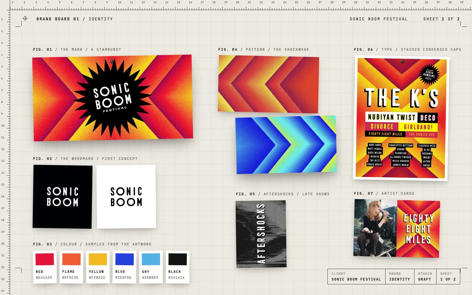
- The Sonic Boom name set as a wordmark, punched out of a black starburst
- A shockwave pattern of chevrons in two colourways, hot red and yellow, cool blue and green
- Stacked condensed type for line-ups, so a poster reads like a gig bill
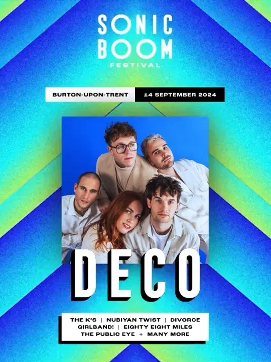
- Artist announcement posters and cards for each act
- The festival website, with artists, the Market Place main stage, Aftershocks shows, tickets and FAQs
- Aftershocks, a darker, glitchy look for the late shows in venues around town
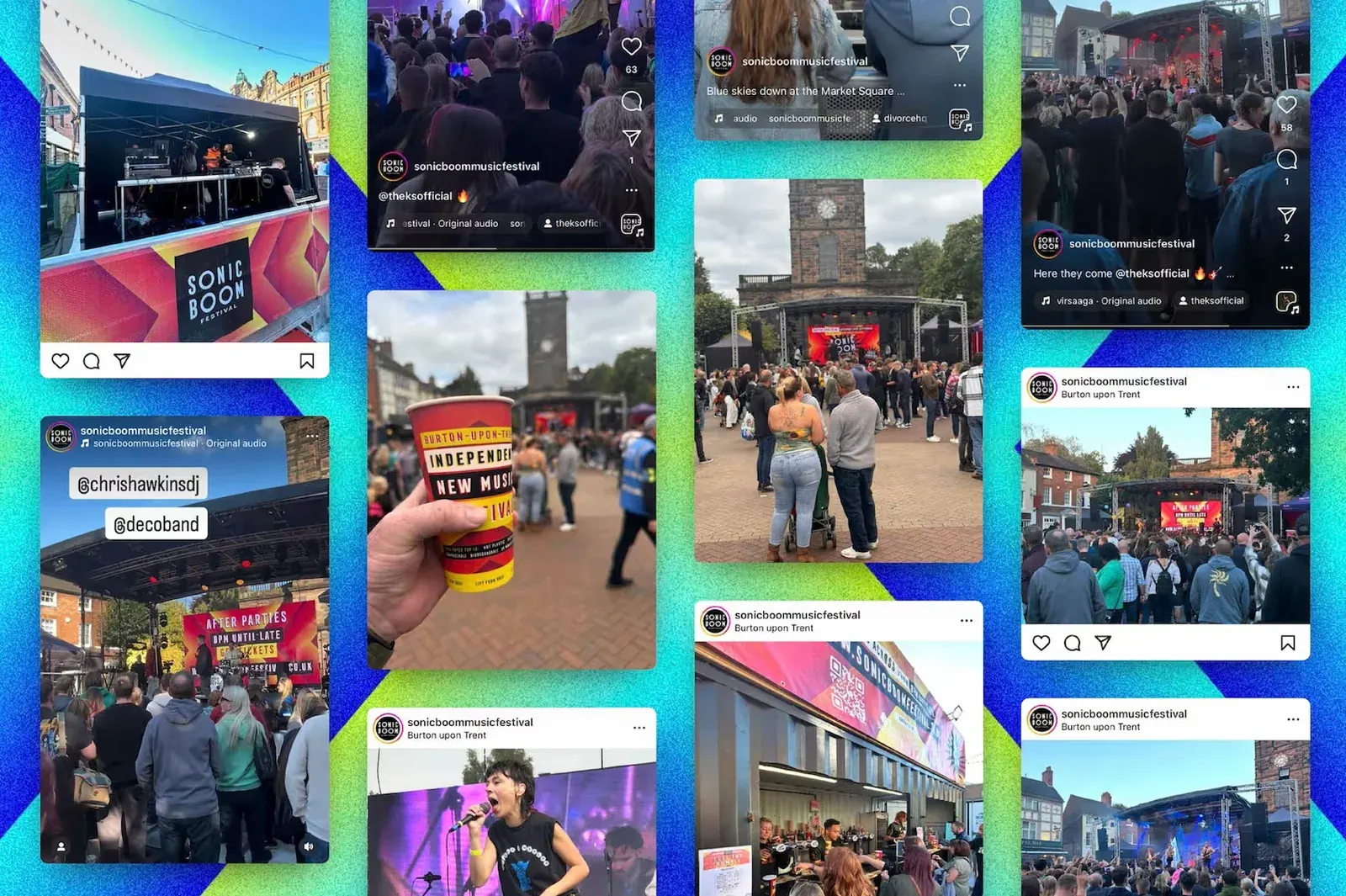
- Social posts and short motion pieces for the build-up and the day
03 / The result
Posters people kept.
The first Sonic Boom ran on 14 September 2024. The starburst was on the posters, the website, the merch and all over social, and the festival has come back every year since. It's a good example of what a strong idea does for a new event. It gives people something to talk about before the music starts.
04 / The longer story
A festival in the middle of town
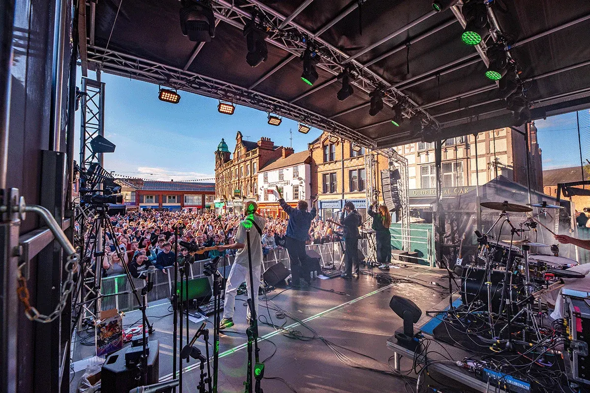
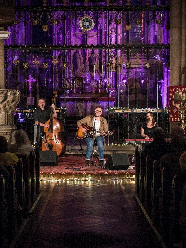
Sonic Boom put a free main stage in Burton's Market Place, right in the middle of town, then kept the night going with Aftershocks shows in venues around town, from bars to a church. That's a lot to explain to people who have never heard of you, so the brand had to be simple enough to get in a second.
The starburst
A sonic boom is the bang you hear when something breaks the sound barrier. Gav took that literally. The wordmark sits inside a black starburst, like a sound effect in a comic, and the chevrons behind it are the shockwave rippling out. Run the chevrons in hot reds and yellows or cool blues and greens and you have two moods from one idea.
Posters that read like a gig bill
Line-ups use stacked condensed capitals in coloured blocks, the way an old gig poster lists the bands. Each act also got its own announcement card, a photo on one side and the name on the shockwave on the other, so every artist reveal looked like part of the same build-up.
Aftershocks
The late shows needed their own feel without leaving the family. Aftershocks swaps the bright colours for black, white and a glitchy, broken-signal texture. Same type, same attitude, after dark.
The website
The site carries the whole festival: who's playing, where the stages and venues are, tickets for the Aftershocks shows, how to get involved and the FAQs. Big type and bold colour, with the same chevrons behind every page.
Where this came from
This was Gav's work at his previous agency, and he led the brand and creative for the festival's first year. It's here because it happened on our doorstep, and because it shows how one sharp idea can carry a brand new event from the first poster to the last song.
05 / Services on this job