- Client
- APPM
- Sector
- Construction
- Where
- Coalville, Leicestershire
- Stages
- Launch
01 / The brief
Say it plainly.
APPM Contracts runs facilities services, project management, M&E and CDM consultancy from Coalville in Leicestershire. "Facilities management" covers a lot of ground, so the plan was to show exactly what APPM does, quickly, and to sound like the people who do it: calm, organised and reliable.
The brand needed to work on a business card, a quote letter and a website, and still say the same thing everywhere.
02 / What we did
Clear, green and to the point.
- Positioning and a tone of voice presentation, written to make APPM clear and concise
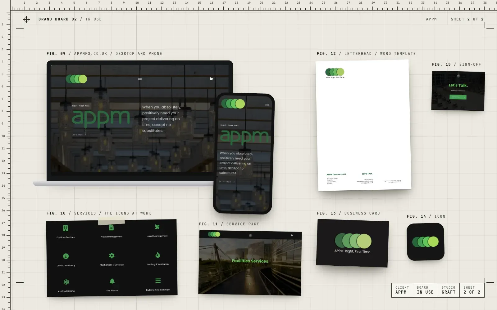
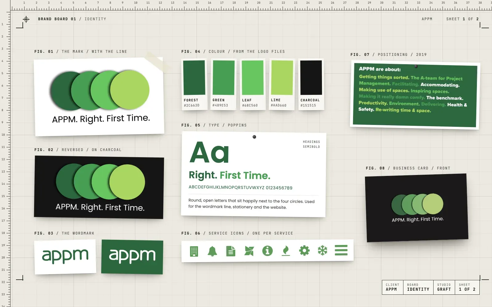
- A refresh of the four-circle logo in four greens, with colour and reversed versions
- The sign-off line "Right. First Time." set with the mark
- An icon for every service, from facilities services to fire alarms
- Letterheads as a Word template the team can use every day
- Business cards for the team
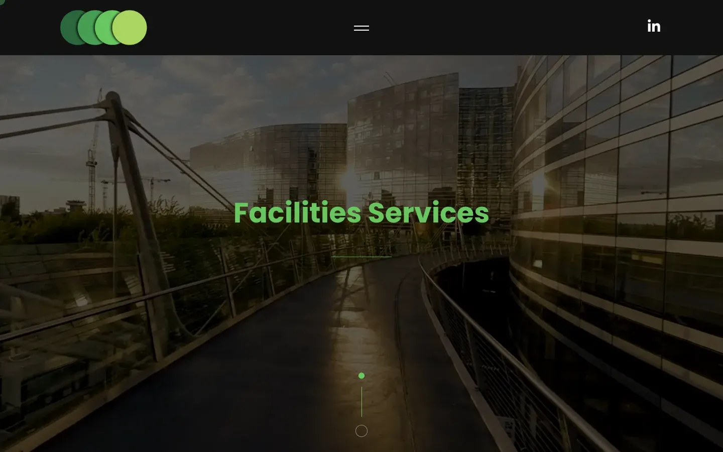
- A new website on WordPress, with a page for every service and a guide to writing blog posts
03 / The result
One line everywhere.
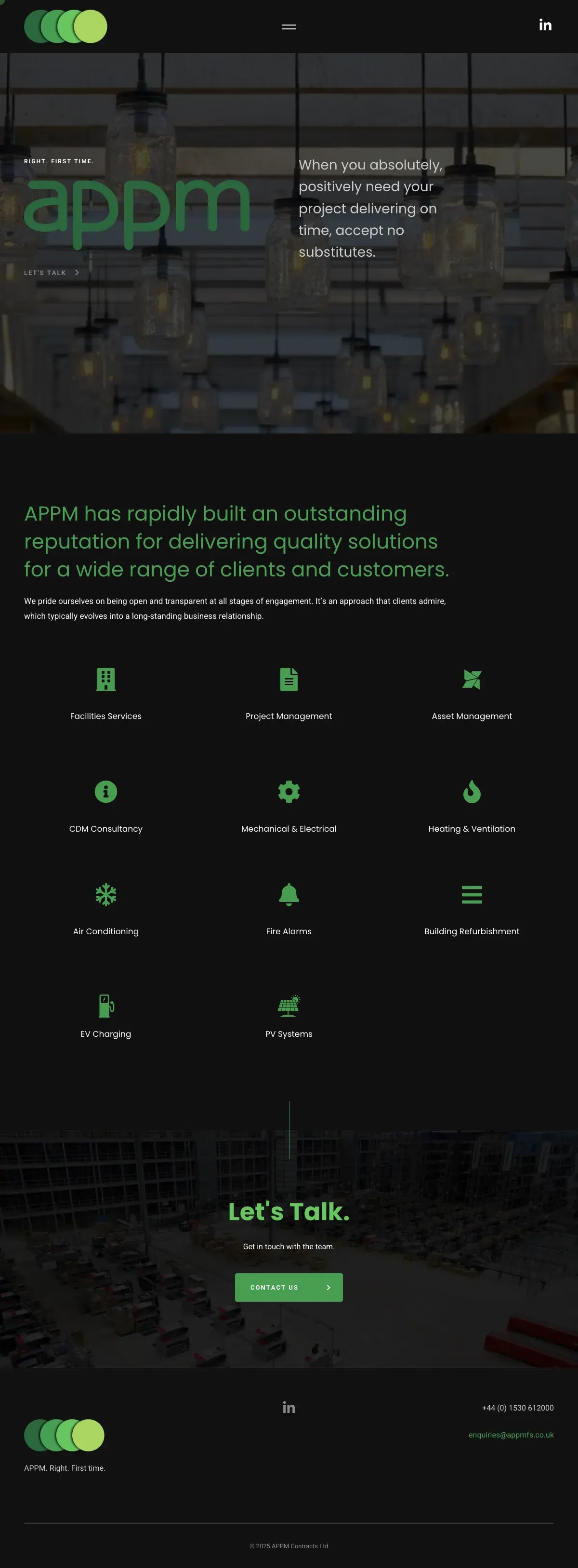
"Right. First Time." now sits under the logo, at the top of the website and at the foot of every letter. The four circles and the service icons still lead appmfs.co.uk, and the site has since grown to take in EV charging and PV systems.
04 / The longer story
What APPM is about
Gav started where he always does: working out what the business is really about. The positioning work boiled APPM down to a few plain ideas. Getting things sorted. Making good use of space. Delivering on time, and doing it properly. The tone of voice followed the same rule. Say less, and say it clearly.
Four circles and a line
APPM's logo already had four green circles beside the appm wordmark. Gav kept both and gave the circles more presence: bigger, overlapping, with a soft shadow, in four greens from forest to lime. Now the circles work as a mark on their own, at the top of the website and as the app icon. APPM already promised work done right first time. Gav turned that promise into a sign-off, "Right. First Time." He set it with the mark so the two always travel together.
An icon for every service
Facilities work covers a lot: facilities services, project management, asset management, CDM consultancy, M&E, heating and ventilation, air conditioning, fire alarms and building refurbishment. Each one got its own simple green icon, so a visitor can find their service at a glance instead of reading through a list.
Paper and screen
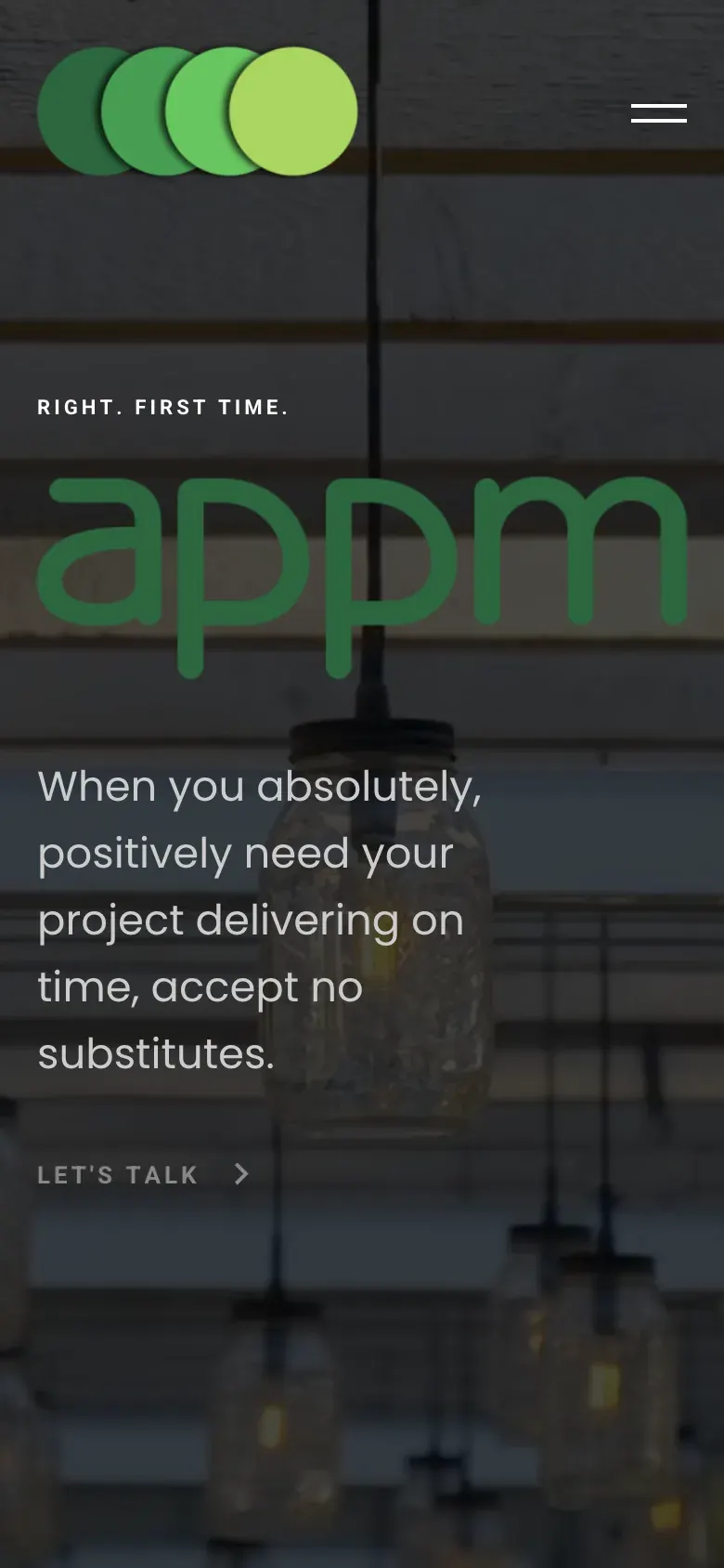
The letterhead was built as a Word template, so the team can write quotes and letters in the brand without asking a designer. Business cards carry the circles and the line on a charcoal front. The website, built on WordPress, puts the wordmark and the line up front, lines the services up as icons and gives each one its own page. A short guide showed the team how to add blog posts themselves.
Built at his previous agency
Gav did this work at his previous agency. The brand and the site are still in use today, and APPM has added new services to the site in the same style.
05 / Services on this job