- Client
- CurraNZ
- Sector
- E-commerce & supplements
- Where
- New Zealand, Australia and the UK
- Stages
- Launch, Grow
01 / The brief
One brand, three markets.
CurraNZ is a small team with a big footprint. Each market has its own store, its own prices, its own rules about what a supplement can say and its own Klaviyo account. The goal has always been the same: wherever someone meets CurraNZ, on a shelf, a phone or in their inbox, it should look and sound like the same brand.
That takes someone who knows the brand inside out and is there every month, not just at launch.
02 / What we did
The whole brand, every month.
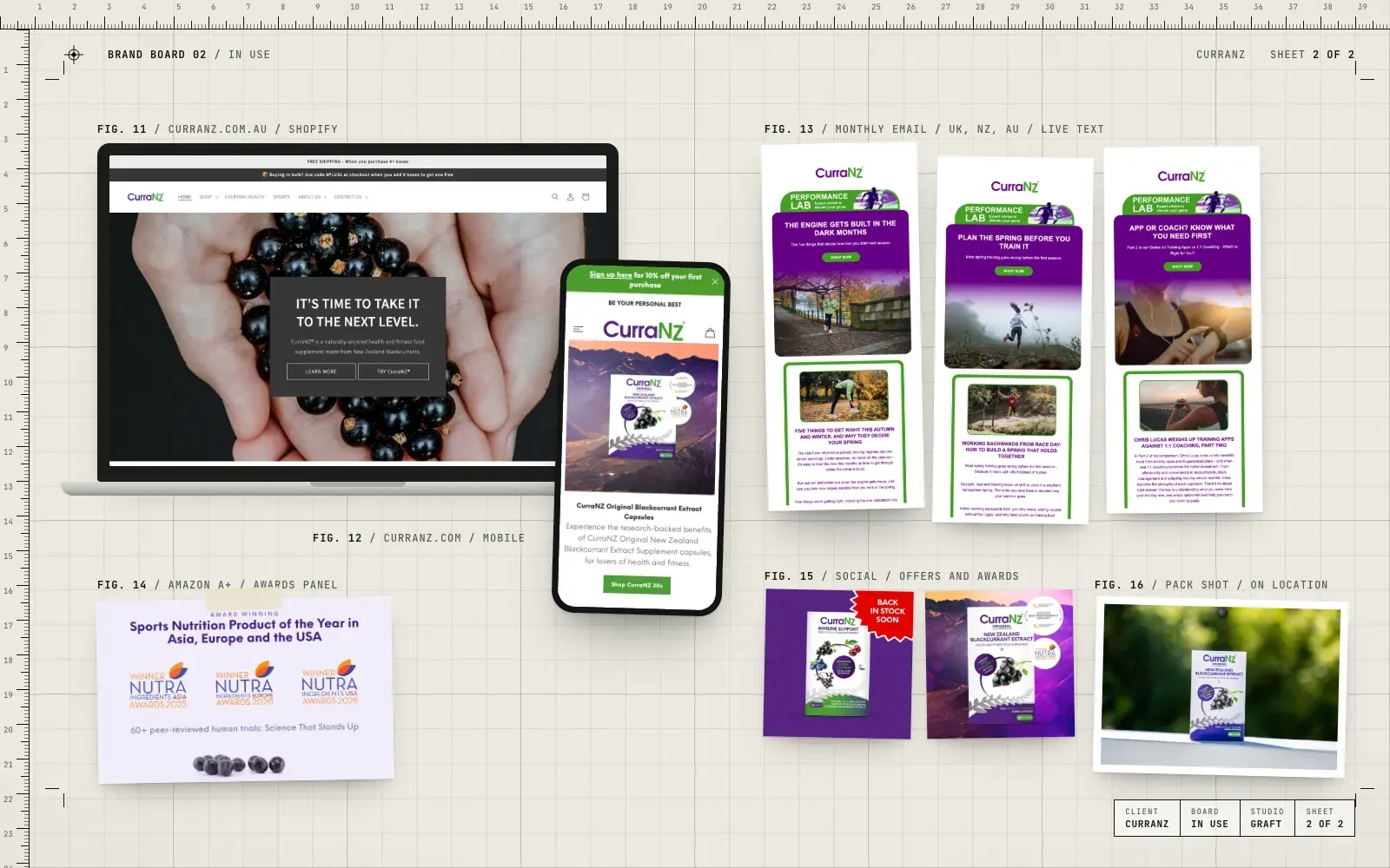
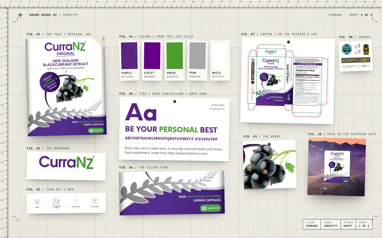
- Brand direction and artwork, from the purple pack and silver fern to awards and ads
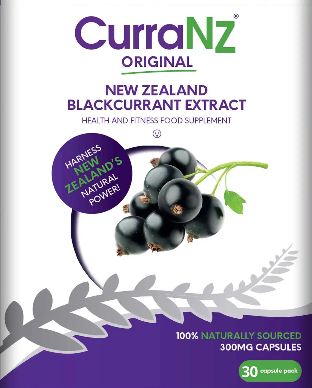
- Pack artwork for the 30 and 15 capsule cartons, rebuilt on each printer's die and checked before print
- Amazon A+ content, award panels and social graphics
- Shopify and Recharge support across the regional stores
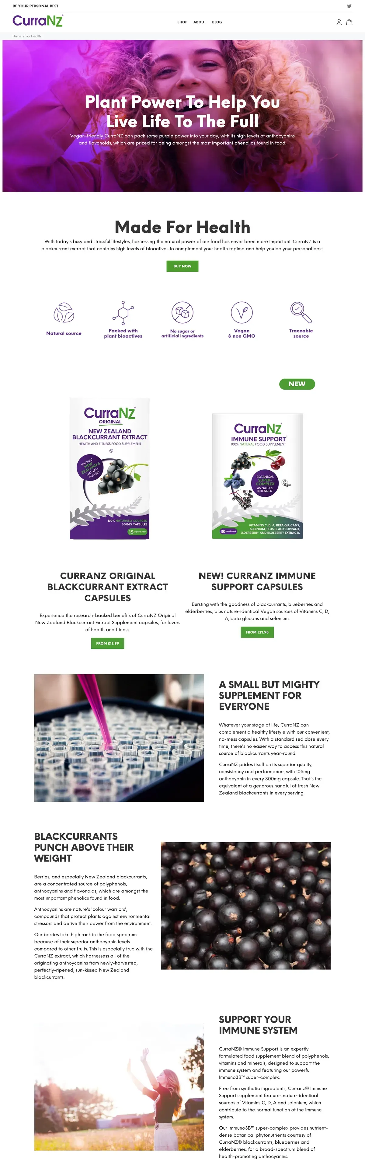
- The architecture for the next version of the website, planned market by market
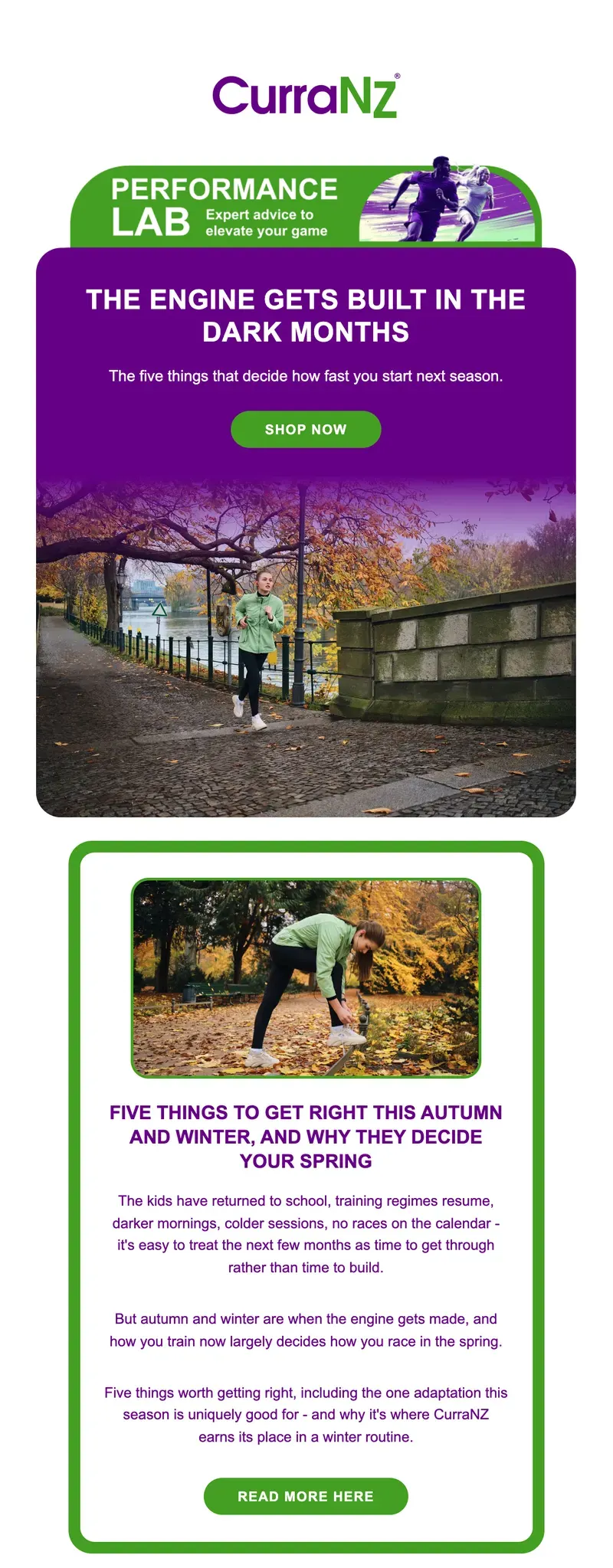
- Monthly Klaviyo campaigns in three accounts, rebuilt in live text
- A private review hub where the client reads, comments on and approves every email
- A full SEO baseline of the stores, ready for the next phase
03 / The result
A safe pair of hands.
CurraNZ looks like one brand wherever it sells. The packs, the stores and the emails all come from the same hands, the client signs off every email before it goes anywhere, and the groundwork is in place for the next version of the site later this year.
We've used the services of Gavin and Monika for many years for our website, design and digital marketing requirements. Their knowledge, responsiveness, energy, work rate and creative genius have been a tremendous asset to our small business. They work as a highly valued and impressive extension to our small operation and perform above and beyond, relentlessly.
There is no-one else we would trust with our design direction for the brand, Gav has been the beating heart of it for a decade and we are excited to see the next iteration this later this year. As usual, the project has been a really enjoyable process, a lot of deep thought and consideration have been poured into the architecture and multi-store set-up and the creative results are impressive.
A safe pair of hands that deliver value and results you can trust and rely on - every time.

04 / The longer story
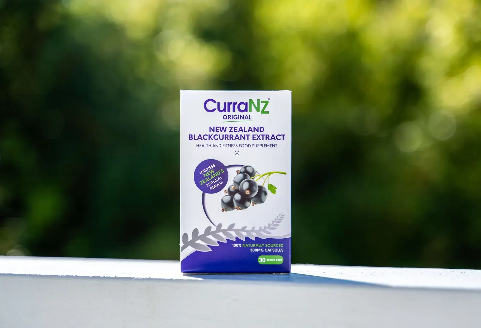
CurraNZ is a family business with a simple product: an extract made from New Zealand blackcurrants, in a capsule, sold direct to people who care about their health and their training. It sells through its own stores in New Zealand, Australia and the UK. Gav has been looking after the brand for around a decade, and these days Graft looks after most of what customers see.
This is how the pieces fit together.
The brand, over a decade
The look is built on a few things that don't move. A purple and green wordmark. A white pack with a deep purple base. A cluster of blackcurrants. A silver fern sweeping across the front, a nod to where the fruit is grown. Headlines set in Neue Einstellung, body copy in Open Sans.
Around that core, the work changes month to month: award panels as the trophies come in, offers and back in stock posts for social, Amazon A+ content, roller banners for expos, flyers for stockists. Keeping one hand on all of it is what stops a brand drifting. Every new piece is checked against the last ten.
Packs that print right
Packaging is where small mistakes get expensive. We look after the artwork for the 30 capsule and 15 capsule cartons, and when a printer supplies a new die we rebuild the artwork on it rather than stretching the old file to fit. Copy is set word for word from the brief, award badges are updated, colours are converted for print, and every file gets an independent prepress check before it goes anywhere near a press.
It's not glamorous work. It's the reason the boxes arrive looking the way they should.
Several stores, one brand
CurraNZ sells in more than one currency, under more than one set of rules about what a supplement can say. So each market runs its own Shopify store, with Recharge looking after subscriptions. We help with the day to day: product and price changes, subscription admin, store fixes and new pages.
We've also been doing the deep thinking for the next version of the site. How the markets should sit together, how each country sees the right content, prices and currency, and how the research is presented. That work is planned now and due later this year.
The email programme and review hub
Email is where CurraNZ talks to its customers every month. Each month we take the content plan and build the campaigns for every market, with the right shop links, prices and footers for each country, in each of its three Klaviyo accounts.
We rebuilt the template in live text: a rounded purple headline card, a single green-framed article, real buttons. It reads better on phones, it's kinder to people using screen readers, and changing a headline takes minutes, not a trip back to the design file.
Before anything is scheduled, every email goes into a private review hub. The client reads each one as it will land, leaves comments on the email itself and approves it. Once signed off, the campaigns are loaded into Klaviyo, matched to the right audiences and scheduled.
What's next
Behind the scenes we've taken a full SEO baseline of every store, so the next version of the site has something solid to measure against. The groundwork is done. Later this year comes the next iteration of the brand online, and we're looking forward to showing it.