- Client
- Upstairs
- Sector
- Hospitality
- Where
- Lichfield, Staffordshire
- Stages
- Start, Launch
- Photography
- Videobox
- Interior design
- FiFi Interiors
01 / The brief
Understated, not underplayed.
A fine dining restaurant lives or dies on the experience in the room. The brand should set the mood before you arrive and then get out of the way of the food. Shouting is the wrong move.
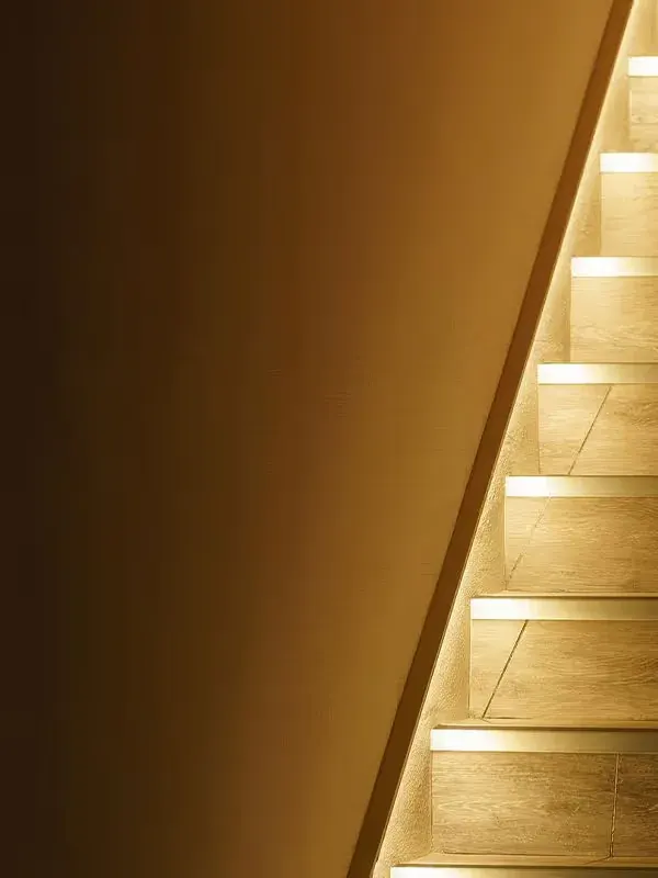
The goal was a brand as considered as the cooking, with a nod to the building's past as a jeweller's workshop and to the thing every guest does first: climb the stairs.
02 / What we did
Up a flight, in brass.
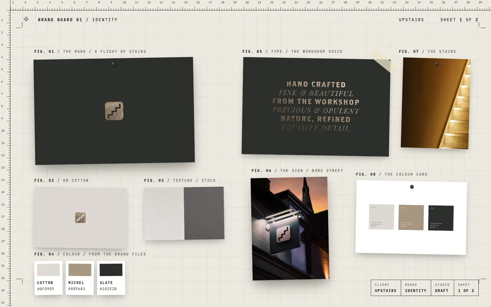
- A stair mark, a simple flight of steps inside a soft square
- A palette from the brand files, Cotton, Nickel and Slate
- Type that pairs strong capitals with fine italics, and a voice drawn from the workshop
- Textured stocks and a metallic finish for the mark
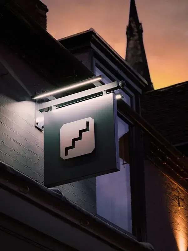
- The hanging sign over the street door
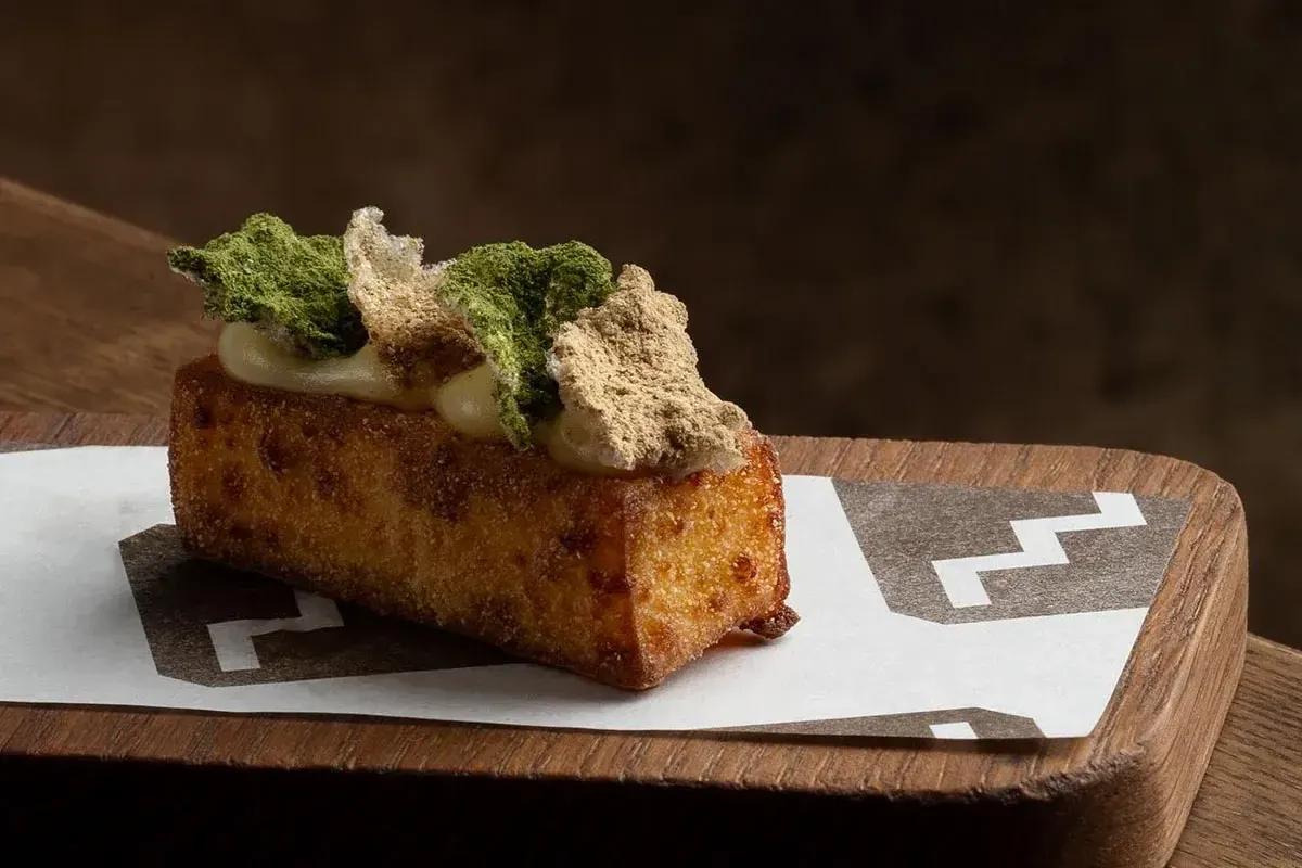
- A stepped pattern for printed paper and table pieces
- Website design, opening on two words, Come on up
03 / The result
A name you can find in the dark.
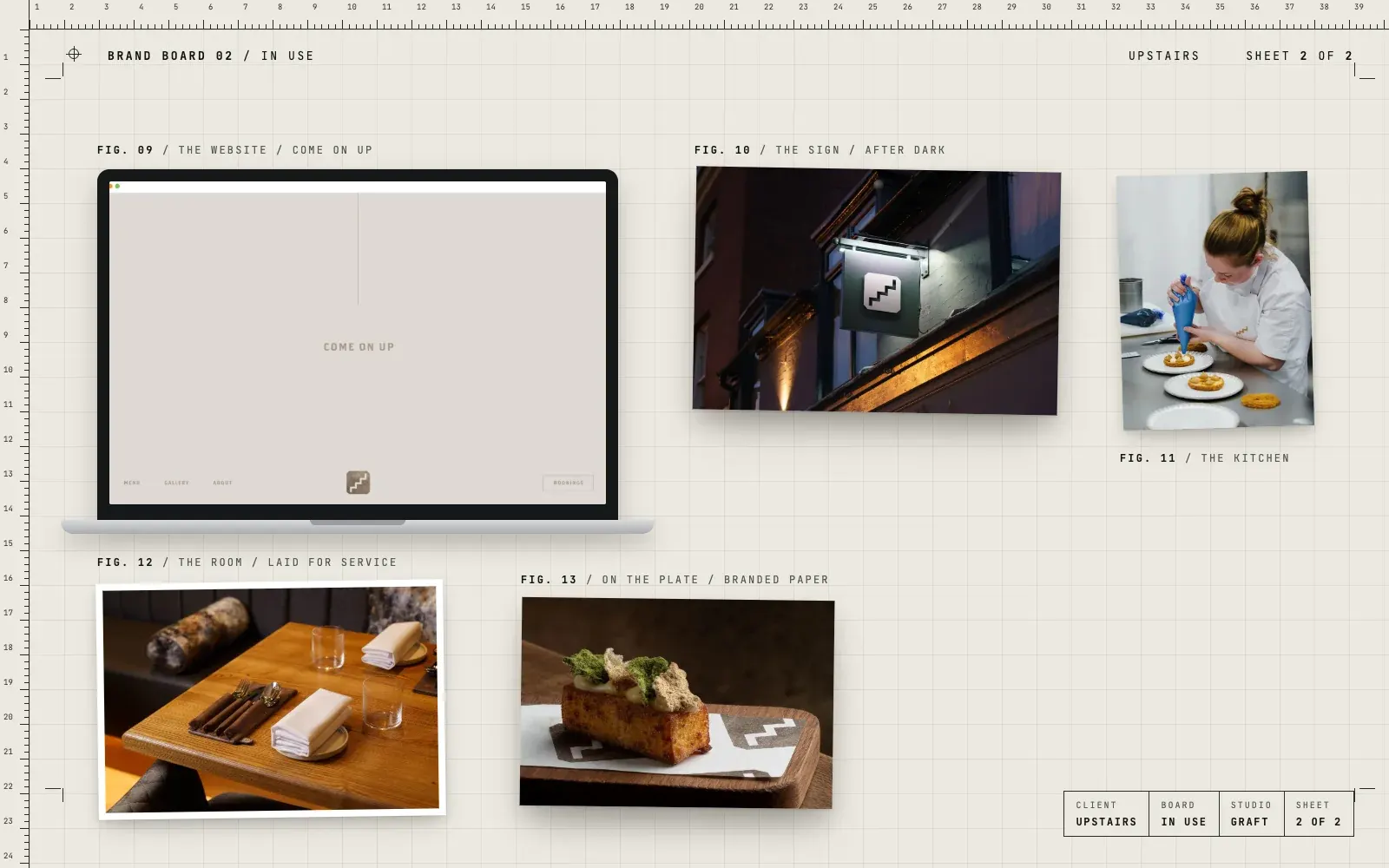
The stair mark hangs over Bore Street, lit at night, and turns up again on the paper under the plates. The palette and type keep everything calm and warm, so the brand feels like the room: careful, unfussy and a little bit special.
04 / The longer story
Come on up
Upstairs is exactly where it says. Guests come in off the street and climb a flight of stairs into a room that used to be a jeweller's workshop. That walk up is the start of the evening, so it became the start of the brand.
A flight of steps
The mark is a small flight of stairs inside a soft square. It's simple enough to work as a sign, a stamp or a favicon, and it rewards a second look. Finished in metal, it nods to the precious things that used to be made in the building.
Cotton, Nickel and Slate
The palette is three colours with names that sound like materials: a warm off white, a soft metallic brown and a deep slate. Together they feel calm and grown up, a backdrop that lets the food and the room do the talking.
Words from the workshop
The type pairs strong spaced capitals with fine italics, like a maker's mark next to a handwritten note. The words lean on the workshop too: hand crafted, fine and beautiful, nature refined, exquisite detail.
Over the door and on the table
The sign hangs over the street door, lit at night, so the first thing guests see is the mark. Inside, the stepped pattern turns up on printed paper and table pieces. The website keeps the same restraint, opening on a single line, Come on up.
Where this came from
Gav worked on this brand at his previous agency, as part of a team with the interior designers and photographers. It's here because it shows how a hospitality brand can be quiet and still be remembered.
05 / Services on this job